The Cheeky Monkey Media Blog
A few words from the apes, monkeys, and various primates that make up the Cheeky Monkey Super Squad.

9 Ways to Create Unique UI Design
 April 19, 2018 / Treena Bjarnason
It might be surprising, but nearly half of all small businesses still don’t have a website! As web designers looking to create cool and unique designs for clients, this is great news. When it comes to unique UI design, the world is your oyster and it’s an all-you-can-eat buffet. So long as you follow the latest trends and stick with best practices, building something unique can be super simple.
Since mobile browsing has finally surpassed desktop browsing traffic, you need to be designing from a mobile-first perspective. With all of the new ways to interact with mobile and online devices, there are a wealth of ways to design unique interfaces. Are you Still wondering which elements to start focusing on for your next UI design? Then pay attention to these 9 design elements to make your next website stand out.
1. Colour Can Speak
Colour is one of the simplest ways to communicate what a brand is to customers. Bold and playful colours can be great if a company is all about fun, community, and engagement. If your audience is very young and fun-loving, this could be the direction to go! For higher-end and more serious business clients, limited palettes are in. Muted pastels, monochrome schemes, and simple, tasteful gradients are all the rage. If your client is selling a luxury product, pay attention to the colours they use in their products. This could be your key to picking the right colours. When it comes to branding, consistency is key in all things.
 2. Text Tells All
Your type can say as much as colours can. A simple sans-serif font can be indicative of a “brass tacks” or no-frills brand. Luxury brands often use serif fonts and take more time to consider every letter and the kerning they use to express their brand’s style. A stylish script font can be effective in communicating quirkiness to an audience. If your client makes a really unique handcrafted product, this could be the direction to go.
3. Scrollable Layers
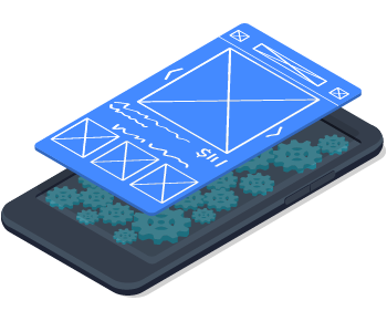
Parallax scrolling has been all the rage for a while now. This allows certain site elements to float above other elements so they move at different speeds as you scroll the page.
Using parallax elements is a great way to divide elements of a page or to create a single-page site. Rather than navigating complex menus for a straightforward set of products and services, clients can get all of their information with a simple scroll.
4. Subtle Slides
Headers, landing pages, and even news sites are using slideshows as a way to engage viewers. Since most news sites use stills more than video, a slideshow can give visitors the latest updates at a glance without making them read too many headlines. Subtly crossfading images allow you to share a lot of information about a client’s products and services without taking up too much space, time, or your customer’s mental power.
5. Let It Breathe
When you visit sites for the biggest retailers, tech companies, and brands, you might notice more whitespace than ever. It’s not just because more users are on mobile devices, it’s also because they realized users were fatigued by loud pages. Pages packed with too much information are jarring, distracting, and hard to navigate. New design trends allow for more breathing room. Text and images are given adequate space without being crammed onto a page. Shorter blocks of text allow fonts to be larger making them easier to read. Even news sites are encouraging more whitespace. Extra text spacing makes a page more scannable to the human eye, allowing pages to be read more quickly and easily.
 6. Encourage Mobile
Users are getting up from their desks, away from their computers, and onto their phones. Even if you can’t design an app you can use your UI design strategy to make websites that look and function like the apps we’re all familiar with. Give your clients boldly coloured call-to-action buttons, simple menus, and quick-loading images. Check your design across browsers and different device types to ensure everything looks equally great. Making sure your design scales easily for mobile devices is crucial for your website design in 2018.
7. Integrate The Social Experience
Make the transition from your client’s primary social media profile a little smoother by copying a few of the design elements. Even something as simple as using their proper brand font can make that transition feel seamless. If they spend most of their time promoting on Twitter, their customers probably like reading short bits of text. If they get customers primarily from Instagram, photos are important to their clients. Make sure your UI design plays to a client’s strengths rather than attempting to make up for any weaknesses. If you’re really great at hockey why are you trying to play FIFA?
8. Big Buttons
Explore what could be an interactive element beyond just buttons and text. Images, colourful shapes, and even parts of videos are now clickable elements. Think about what’s most important to your client and what their customers engage with the most, and what they would like to engage with more. Knowing this, you’ll have a great idea of which elements they’re likely to click on a screen. Try dividing the screen up into clickable elements instead of creating a main menu space. Let users see what they’re looking for and simply click that image or icon to get it.
 9. Live Updating
Live streaming and live updating are all the rage right now on every social media platform. All of the “big three” social networks (Facebook, Instagram, and Twitter) have introduced live streaming features. Integrating some of these elements into your client’s website helps their customers feel like they’re getting an exclusive behind-the-scenes look. A Twitter feed or a live feed from onsite could be engaging to customers. For example, if your client runs a doggy daycare, make a live video feed of the puppies the central element of the main page. This will keep viewers on the site for longer and have them visit more often. Use banner ads to help promote other services available to your client and take advantage of their clients’ engagement.
Great UI Design Takes Trial and Error
Look at what your favourite sites are doing and see how you can learn from them. Look at the competitors of your client and see which mistakes they’re making and how you can do better than them. Always be looking at other sites for ideas on what’s new in UI design. After all, research should always be your first step in the design process. If you’re interested in finding out about new strategies for implementing these design tactics, contact us for ideas.
 6. Encourage Mobile
 9. Live Updating