The Cheeky Monkey Media Blog
A few words from the apes, monkeys, and various primates that make up the Cheeky Monkey Super Squad.

The Power of Page Builders
 July 10, 2019 / Treena Bjarnason
These days, that’s different. New WYSIWYG (what you see is what you get) editors have made it simple for anybody with an online computer to build a site. Gone are the days of having to hire a webmaster to change the spelling of “their” to “they’re.” Now you can log on to your site, click a couple of things, retype some words, and presto! You’ve updated your content. Want to rearrange your pages? It’s as easy as playing with some Legos.

With Great Power Comes Great Flexibility
Sounds pretty great, eh? Page builder flexibility is excellent, but there are things to keep in mind before you’re at that point. Key considerations include:
- Designing using a “block” method with a page builder in mind
- Developing to use a flexible page builder without creating “option overload”
- Migrating content from your old non-page builder site to a new page-builder site
You need to approach a site with a page builder in a different way than one without. Thorough prep work at the start of the site lets you take advantage of all the features page builders have. Let’s start by looking at the design.
Let’s Think Lego
Designing a page builder site is a different beast than a “regular” site. The webpage design process typically goes something like this (albeit super simplified):
- Create a custom design for each page that is a top-level nav item (home, about, contact, etc.)
- Create designs for one or more generic pages for interior content.
- Pass these designs off to your developer to turn into pages.
- Add your content.
The page builder workflow is similar, but with one fundamental distinction. You’re designing “blocks” rather than entire pages. That’s not to say you can’t make custom pages, but the “blocks” are the critical thing to remember. The page builder design process looks something like this:
- Identify what types of content blocks or elements you need (gallery grid, news article, staff bios, etc.).
- Pass these block designs off to your developer to turn them into usable web elements.
- Build your pages out in your page builder using the blocks you designed.
- Add your content into the blocks.
Right away, it should be clear how simple page builders make customizing your site. Working in a modular “block” approach, instead of full pages, means you can build or rebuild your site like a Lego set. Now you don’t need years of code know-how to move some parts of your site around; you can drag and drop them! That’s not to say you can’t create one-off custom pages for more complex things like your home page. It means that now you can create those pages with the added flexibility a page builder affords.
Here’s an example of how a work-in-progress page builder site design might look. You’ll notice that the page is extremely long, but consists of a whole bunch of different sections. On the left is the plain design file. The right side shows the different reusable blocks, highlighting to show each block. This example should give you some ideas about how you can stack elements to create any type of page imaginable!

Mix’ n’ Match
When it comes to the CMSs we use here at Cheeky Monkey Media, our big two are WordPress and Drupal. These two are a tiny sample of the hundreds of CMS options out there, but not all have page builders. WordPress alone has dozens of different page builder options. Since features vary from one system to another, we’re only going to focus on some general rules in this article. We’re not getting into specific page builder plugins, modules, or other software. Some tools like Squarespace or Wix can let you start building sites without needing any code at all. While that sounds nice, those can be much more restrictive than a CMS that might need at least some coding to begin.
Now, get ready for this, because it’s pretty exciting (or maybe we need some new hobbies). When you’re developing a page builder site built with blocks, you only need to code each block once. That’s right. You can reuse a block in dozens of places on your site, each with different content and styling. The best part is that you only need to code it once!
Sure, reusing code is nothing new. However, the level of reusability that page builders and blocks give you is truly next-level stuff. We won’t get into nitty-gritty code talk here, but we’ll give you some general guidelines to follow. Keep these things in mind when developing blocks for a page builder:
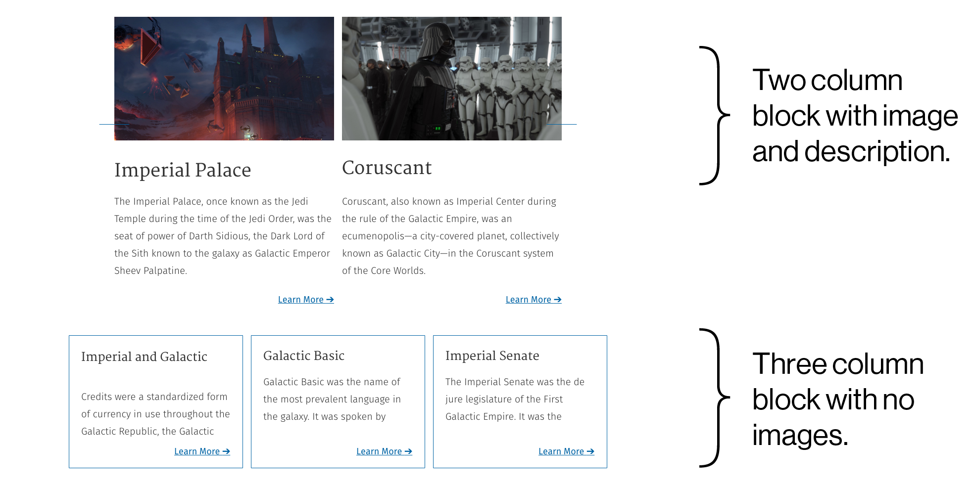
- Before coding anything, make it abundantly clear which elements of your block are variable. Note what the options are and how many options each variable element has. The example below shows an example block with options to change stroke colours, font colours, images, stroke positioning, background colour, and more.
- Sometimes blocks with variable elements have things that dynamically change based on other options. For example, the image below shows a quote block with several variable elements. These include background colour, font colour, and quotation mark colour. When the background colour changes, the font and quotation mark colours automatically change colour too. These automatic switches help avoid white text on a light background or black text on a dark background.
- How do these blocks stack up on mobile? It pretty much goes without saying as it’s the current year and all that, but you’ve gotta keep mobile at the front of your mind. If you have a block that has three columns, do those columns collapse or do they stack when you move to mobile?
I’d Migrate Five Thousand Lines, Then I’d Migrate Five Thousand More
If you’re not building a brand new site from the ground up, this might be the most important part. Unless, of course, you want a totally broken site. Content migration is tricky, but it’s trickier when you’re moving to a page builder system. Usually, the solution to this problem is a two-pass content migration process.
The first of the two passes is a programmatic pass of the data. You’ll identify which data you want to pull out. You’ll identify where you want to pull it from, and where you want to put it. Thanks to the wonders of technology, you can get a big chunk of the migration work done automatically. Aren’t computers neat?
The second pass is a manual pass. What you’re doing during this manual pass is taking the roughly exported data from the programmatic pass and cleaning it up. You’re making sure it’s all displayed correctly and is in the right locations. Yeah, I know, that’s a bit vague. Unfortunately, the nature of the beast means that no two migrations are going to be precisely the same. The process can cause headaches, but it’s an important one to make sure your site is usable and customizable.
 So… Now What?

Get in touch with us today, and we’ll tell you how we’ll make your vision our mission. Visit our website, follow us on Twitter, like us on Facebook, and check out our latest posts on Instagram.
 So… Now What?