The Cheeky Monkey Media Blog
A few words from the apes, monkeys, and various primates that make up the Cheeky Monkey Super Squad.

Website Wireframes: 3 Options That Fit Any Budget
 October 7, 2021 / Ashley Olsen
Starting a new web project can be daunting. Technical terms that you may not have heard before getting thrown around, and it can be overwhelming to get familiar with the new jargon. One word that you’ve probably heard during your website journey is Wireframe, and lucky for you, it’s pretty basic to remember. Website wireframing is a three-step process, so let’s break it down.
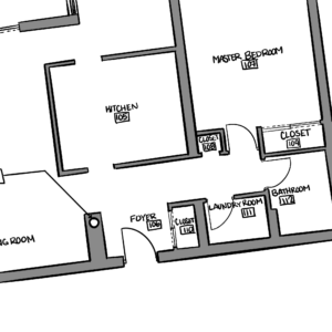
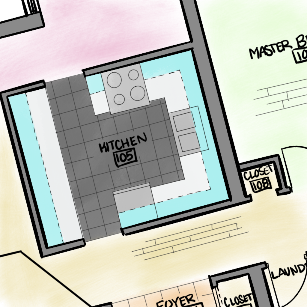
I like to think of wireframes as if they are floor plans. You can’t get to the rendering stage without planning the blueprint of the walls and decor. In terms of a wireframe, you can think of a low-fidelity as the walls (including doors and windows), mid-fidelity as adding in the furniture, and high-fidelity as the 3D rendering or mockup of what the final product looks like.
“Why can’t I just have the high-fidelity version?”
Now, what the client sees may only be the high-fidelity version of the wireframes, the process that the designer goes through to get the wireframe to that point can’t be done without going through the other steps. Part of why we do this is that changing the layout and content types is faster and easier during the first stage of the wireframing process while everything is represented as boxes, saving you time in the long run.
Everyone wants to see the end product – the shiny, new, high-fidelity design that will become your website! Imagine if you went to the store to buy your carpeting and fancy wallpaper for that stunning feature wall you’re planning to have in your living room, along with a brand new furniture set, before your architect provides you with the blueprint of your home. The carpet doesn’t reach to the corners of the room, the wallpaper only covers half the wall, and the new leather couch is way too big for the best corner of the room. Your new living room isn’t what you thought it would be and now you hope that couch and carpet can be exchanged and you can track down more of that fancy wallpaper. Such a headache, and a waste of time and money.
This is why wireframing, when done right, has a 3-step process. Low fidelity is your blueprint that shows your walls and where you will have windows and doors, mid-fidelity is your floor plan that details where the couch will go, and finally, the high-fidelity rendering shows you a realistic representation of your dream home!
Step 1: Low-Fidelity Wireframes – The Walls
 Remember the above reference? “The low-fidelity wireframes are the walls, windows, and doors” of the web pages. They outline where the content and text will go, and where any calls to action (CTAs) will be located, all using different shades of grey boxes to represent a hierarchy. They’re annotated to describe what type of content should be included in these boxes. We’re talking headings, banners, imagery, videos, etc. We wouldn’t recommend skipping this step. It lays the groundwork for the rest of the project, makes the other processes faster, and prevents a time sink when you have to adjust details. Who actually needs another reason to do the steps? The low-fidelity wireframes ensure that everyone has a good understanding of the website’s functionality before moving on in the process.
We generally budget between 30mins – 2 hours per page for a low-fidelity wireframe. Stopping at the low-fidelity stage is a great option for lower-budget projects. They still provide a very valuable blueprint for the page that the developers understand, without eating up a large chunk of the project hours.
Step 2: Mid-Fidelity Wireframes – The Furniture

Now that our walls are built, it’s time to add that fresh new furniture aka content. Once the page layouts are approved on the low-fidelity wireframes, we move on to adding content to inject a little life into the designs. While the imagery is still not in the picture and grey boxes are used as placeholders, written content or placeholder text (lorem ipsum) can be added to give stakeholders a better idea of how the site will look in the end. In some cases, ie. If you’re
stopping at the mid-fidelity stage, some color can be added to give a better idea of the feeling behind the designs, although the color is generally added to high-fidelity wireframes.
These frames generally take a designer between 2-5 hours to complete. Mid-fidelity can also be a strong option for lower to middle-budget projects, as they give you a better idea of how the site will look and feel. Another plus is they don’t bank as much time as a high-fidelity wireframe can.
Step 3: High-Fidelity Wireframes – The Rendering
So we have our walls built, and our furniture placed – now it’s time for the rendering. A high-fidelity wireframe (sometimes called a prototype) shows the best reference to how your website will look once created. Imagery, color, and text should all be real content the live site will have; placeholders should all be removed at this point. These not only look cool, but they provide the best reference for the developers working on your site. Everybody now has a way better visual of how your site will look.
The last step of the 3-step wireframing process is the most time intensive. Each page takes designers anywhere from 3-10 hours to complete, depending on the complexity of the site. This covers any last-minute edits and changes that can inevitably happen at this point. These are best for projects with a higher budget.
Of course, we would love to recommend using all three steps for your website project, but if budget and timeline don’t allow it, at the bare minimum the low-fidelity wireframes should be used in every single project. Seriously, these should not be skipped. Because moving content placeholders to determine layout is much easier and quicker on a low-fidelity wireframe than on a high-fidelity one.
Who All Benefits from Wireframing?
We love that a wireframe can pass through the hands of anyone involved in a project and be invaluable. These can include but are not limited to Project Managers, Content Creators, SEO specialists, Developers, Quality Assurance, Users, Visual Designers, and the Client. Wireframes provide different benefits depending on who uses them. For the Client, they provide a visual representation of what the site will look like. Content creators, provide a map to understand what content is needed for the site. For developers, they are a map to not only the type of content specified, but where that content type goes, colors used, text hierarchy, yadda, yadda.
Is anyone as excited as we are? Oh, Mylanta! But what you should remember is that wireframes are a blueprint for each of your departments, roles, and stakeholders involved in the project, and their purpose changes depending on who’s looking at them.
Now you know there’s a useful wireframe option for your web project, no matter what its size. But, if we have to pick the best bang-for-your-buck investment, low-fidelity (the walls) is arguably the most important stage in the process, since good planning minimizes issues and fixes that’ll have to be made later on in the project.
If you’re ready to get a wireframe built for your next web project, we’d love to help.