The Cheeky Monkey Media Blog
A few words from the apes, monkeys, and various primates that make up the Cheeky Monkey Super Squad.

10 Web Design Trends to Watch for in 2018
 January 24, 2018 / Treena Bjarnason
If you want your website to stand out, you need to make sure you’re following the latest web design trends.
In 2017, 57.7% of small to medium-sized business owners stated that they wished to invest in new and improved website design in the future. The main trigger for this move is the fact that web design is constantly evolving and changing to suit the needs of any user base.
There is one big question you should now be asking yourself. “How can I improve my own website design?”
Through social media optimization.
A social media optimization service can assist you in creating eye-catching and engaging content in a number of ways. Below, we have listed ten website design trends which are guaranteed to become wildly popular in 2018.
Keep on reading.
Bright Colors
One of the most popular web design trends of 2018 is bright, bold colors. These types of colors are incredibly eye-catching thus they can easily get a web user glued to the design. Due to their brightness and freshness, they greatly appeal to younger users.

If done correctly, bold colors can help make a boring company website look more engaging and exciting. This is perfect if you’re concerned that your content may be dry or unengaging.
Asymmetrical Designs
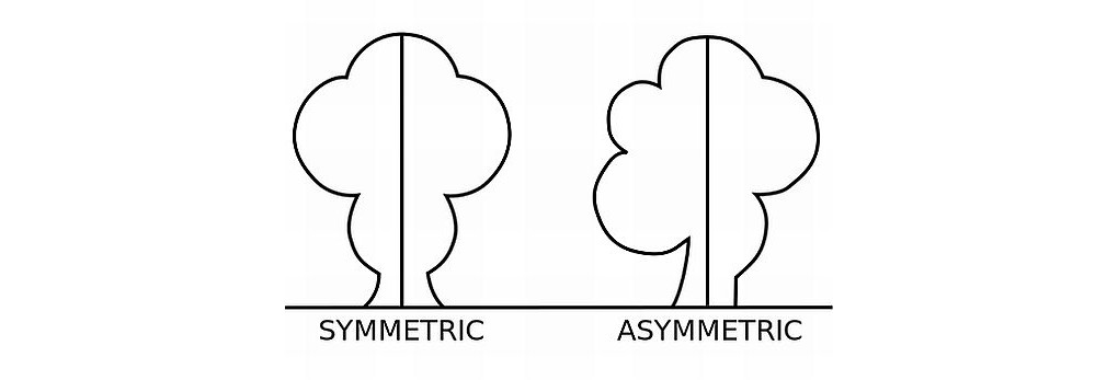
Over the past couple of years, web design trends have been leading away from symmetry and heading towards asymmetrical designs. With the rise of design forms such as brutalism, asymmetry has only become more and more popular.
Asymmetry works well because it helps you avoid a boring static design that may otherwise disinterest a web user. It also works well-directing user attention to different aspects of your website.
It’s important that when you go for an asymmetric design, there is a balance of elements. Otherwise, you may end up with one side of the design that is overpowering. To help balance visuals, it’s a good idea to use a variety of space and text elements.

Animation
Animation is one of a few web design trends that users have a lot of fun with. Not only can they give the user information, but they can assist in leading them actively through the website.
There is a variety of animation types you can use. It could be something as small and subtle as a loading features on a mobile app that amuses your user base and encourages them to wait. Alternatively, it could be a hover state or even a large illustration that comes to life.
Just be sure to not go overboard with animation. Choose one animation type and stay with it. Also, make sure your animations are realistic and play on a loop so that your users are aware of when the animation has finished.
Being considered the new norm in web design, the animation is a necessity that you need to incorporate into your website. Matter of fact, the incorporation of animation into websites has recently been a source of awards for some of the leading websites in this design trend.
Non-Minimalistic White Space
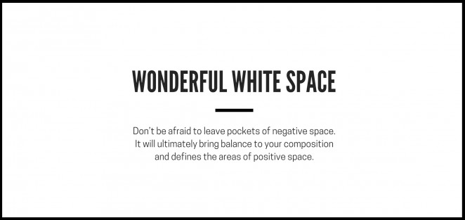
White space is greatly loved by designers for its use in minimalism, but the latest web design trends show that it is being used more and more for a less minimalistic feel.
By taking an empty white space and filling it with color and design elements, it can feel fuller and become more engaging to the users.
Video Effects
In this day and age, videos are more than just something for users to watch. As web design trends grow and evolve, videos are now becoming embedded in multiple areas of a website, to serve as a source of extra information.
The biggest advantage of video is that it delivers information much quicker than text.
Subtle Scrolling Effects
Scrolling effects such as parallax scrolling animations were incredibly popular in 2017 and will continue to be popular in 2018. They are an effective way of encouraging engagement to your users.
You don’t have to go with this type of scrolling effect, though. Another popular scrolling effect is to use a background image attached to the website that doesn’t scroll with the page. This is a very effective way to catch the attention of your audience and keep them engaged with your content.
Sticky Navigation
We aren’t just referring to pop-up ads. Sticky navigation could refer to notifications, chat boxes and even elements for navigation. Having been so used to this in mobile apps, users are very accepting of this design trend and many prefer to have sticky navigation on most websites they use online.
This is because the user is able to use and engage with it, but it doesn’t obscure any content to the point that it is annoying or interfering with their browsing experience.
This sticky navigation has even led to the rise in popularity of floating header menus. Like sticky navigation, it doesn’t obscure content and it makes the menu appear to float. This allows any visuals on the homepage to continue behind the menu.
Smooth, Curved Shapes
In 2017, sharp geometry and shapes were the big things. In 2018, it’s predicted that a softer, more fluid look will dominate web design trends.
Like with most modern design trends, smooth lines always seem to follow along with polygon trends. Think about modern architecture or art decor. What started as jagged and sharp always seems to slowly progress to a smoother, more curved design.
Split Screen Desktop
Another aspect of web design trends that is only continuing to rise in popularity is split-screen design patterns.
The reason why these designs are so popular is that it provides an enjoyable experience for users on mobile devices as well as desktops. This is because a split screen helps to balance how the content is displayed and it allows it to stack well.
Early versions of split screens were just that, split screens. Nowadays, designers are aiming for a more modern approach by incorporating an additional layer of text or branding on top to provide a more in-depth effect.
Interactivity
Nothing appeals to users more than a completely interactive web experience. This can include anything from games to polls and quizzes. This not only personalizes the web experience, it connects the brand name to interactivity.
Your users will remember how enjoyable they found your website and they will recommend it to others!
Closing: Following Web Design Trends Will Make Your Website Appealing to Users!
If you want a website that people enjoy using, you need to include a great majority of these upcoming design trends. Stay ahead of the crowd and get an SMO specialist to assist you in updating your website today!
For more information on how an SMO service can help you or to get a quote, click here!

