The Cheeky Monkey Media Blog
A few words from the apes, monkeys, and various primates that make up the Cheeky Monkey Super Squad.

Web Design Inspired by the Stars: Doug Chiang’s Impact on Website Designers
 April 25, 2019 / Treena Bjarnason
Every website designer seeks inspiration to create eye-catching, innovative designs. While one might look at popular design websites or award-winning pages, others find inspiration in unexpected places.
Case in point: Doug Chiang’s remarkable contribution to the world of film design, especially in the beloved Star Wars series. Although Chiang’s work primarily graces the silver screen, his design principles resonate deeply with the tenets of web design.
The intersection of these two worlds – cinematic design and website design – exemplifies the boundless sources of inspiration for today’s web designers. Let’s dive into how Chiang’s journey and guiding design principles influence and inspire website designers around the globe.
A long time ago in a galaxy (well, country, I guess) far, far away….
 On February 16, 1962, a baby boy was born in Yilan County in northeastern Taiwan. His name was Doug Chiang. Little did his family know, that their newborn son would become one of the most notable designers working in science fiction. You might not recognize his name, but you’re more than familiar with his work.
Born in Taiwan but raised in the United States, Chiang’s creative career started with a bang. His first gig in his film and design career was as a stop motion animator for this weird little show called Pee Wee’s Playhouse. Later in the 80’s he attended both the UCLA Film School in Los Angeles and studied Industrial Design at the College for Creative Studies in Detroit. The unique combination of film fundamentals and industrial design know-how gave Chiang a leg up in the world of making movie magic. Once he was all finished with school, he landed positions as a commercial TV director at Rhythm and Hues and several other LA production companies. His next role at Industrial Light and Magic (ILM) had him in the shoes of a creative director, tasked with art directing the visual effects for movies like Terminator 2, The Mask, and Forrest Gump.
In 1995, while at ILM, Chiang was hand-picked for a new position by one of his heroes. The person? George Lucas. The job? Design Director and Art Department Head at Lucasfilm. Now, I don’t know how much you know about Lucasfilm, but they make these little movies called “Star Wars.” As Lucasfilm’s Design Director, Chiang was responsible for crafting the visual language and design direction for Star Wars Episode I: The Phantom Menace and Star Wars Episode II: Attack of the Clones. Be it thumbnail sketches, concept paintings, or miniature buildings, Doug Chiang had a hand in nearly every visual aspect of these films.
Eventually, he’d leave ILM and Lucasfilm to start his own company, IceBlink Studios. At IceBlink he worked on Steven Spielberg’s War of the Worlds. Later, IceBlink, Disney, and Robert Zemeckis partnered up to create another new company, ImageMovers Digital. Chiang’s role at ImageMovers was Executive Vice President, and he and his team worked on technically groundbreaking motion capture films such as The Polar Express, Beowulf, and Disney’s A Christmas Carol. In 2013 he was hired back by Lucasfilm as Vice President and Executive Creative Director just in time for him to get to work on Star Wars Episode VII: The Force Awakens. He’s since worked on not only the new films (like Rogue One: A Star Wars Story and Solo: A Star Wars Story), but also on video games, comic books, new media (like VR), and even the new theme park Star Wars: Galaxy’s Edge. Pretty cool gig, eh?
Here’s the part of the article where I have to chime in and say yeah, okay, you caught me. A big part of why I’m writing this is because I like Star Wars and the saga has influenced me in almost every aspect of my life. Yes, that includes my web and graphic design career. Deal with it. Okay? Okay.
During his initial seven-year stint at Lucasfilm Chiang’s got to work alongside one of his childhood heroes, George Lucas. If he was going to be working closely with George Lucas himself, Chiang knew he had to step his design game up. To avoid more of his sketches ending up on George’s “Wall of Shame” he laid out six guidelines for himself to follow.
What I’m about to do might blow your mind. I’m going to tell you how I apply Doug Chiang’s six principles for creating ships, vehicles, creatures, architecture, and everything else in the Star Wars universe to my graphic and web design work. Alright, ready? I’m gonna lay out Doug’s six principles, how I use them in my design work at Cheeky Monkey Media, and then an example of Doug using them in his Star Wars work.
1. Strong Silhouette: Is your design iconic?
The strong silhouette principle can be applied to everything I design, but it’s especially helpful when I’m working on logos, branding, and other types of identity design. If the marks you’re creating don’t stand out among the crowd and stick in the viewers’ minds, you haven’t done your job as a brand designer (in my opinion). Look at the Nike swoosh, for instance. Its sharp silhouette is known worldwide as “Nike,” even without the company name alongside the swoosh.
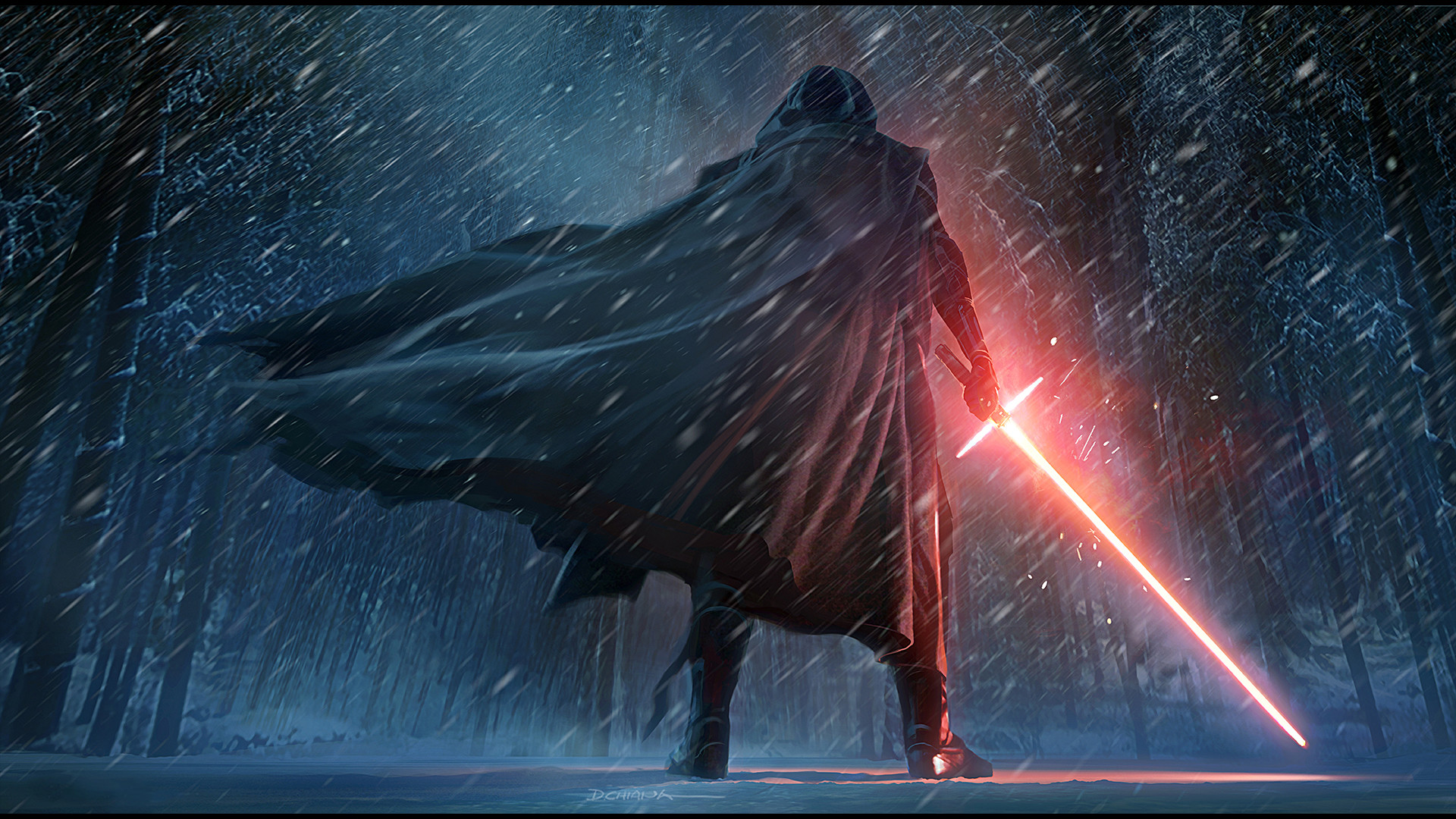
Star Wars example: Kylo Ren’s crossguard lightsaber. The idea for Kylo Ren’s unique crossguard lightsaber came about as a way to differentiate him from other Star Wars baddies like Vader or Maul. Adding this small change to the already iconic lightsaber gave Kylo Ren a new, powerful feeling while still being familiar. There’s even a touch of a medieval broadsword in there, showing the viewer that this is a different kind of bad guy for a different time in the galaxy. Nerd time: in-universe, the saber has side vents to deal with the unstable energy from Kylo Ren’s cracked kyber crystal.
2. Three Second Rule: Can you easily understand the design in three seconds or less?
When it comes to interfaces and the experience behind them, this is the most important principle to me. Make it apparent what your interface does. Using hierarchy, color, scale, and all the other tools at your disposal, you should be crafting your interfaces with understandability as your first priority. Doing this means sticking to common patterns like having your mobile menu button in the top corner of your page, putting toolbars on the left side of your desktop application, and using simple icons and universal symbols for things instead of trying to reinvent the proverbial wheel.
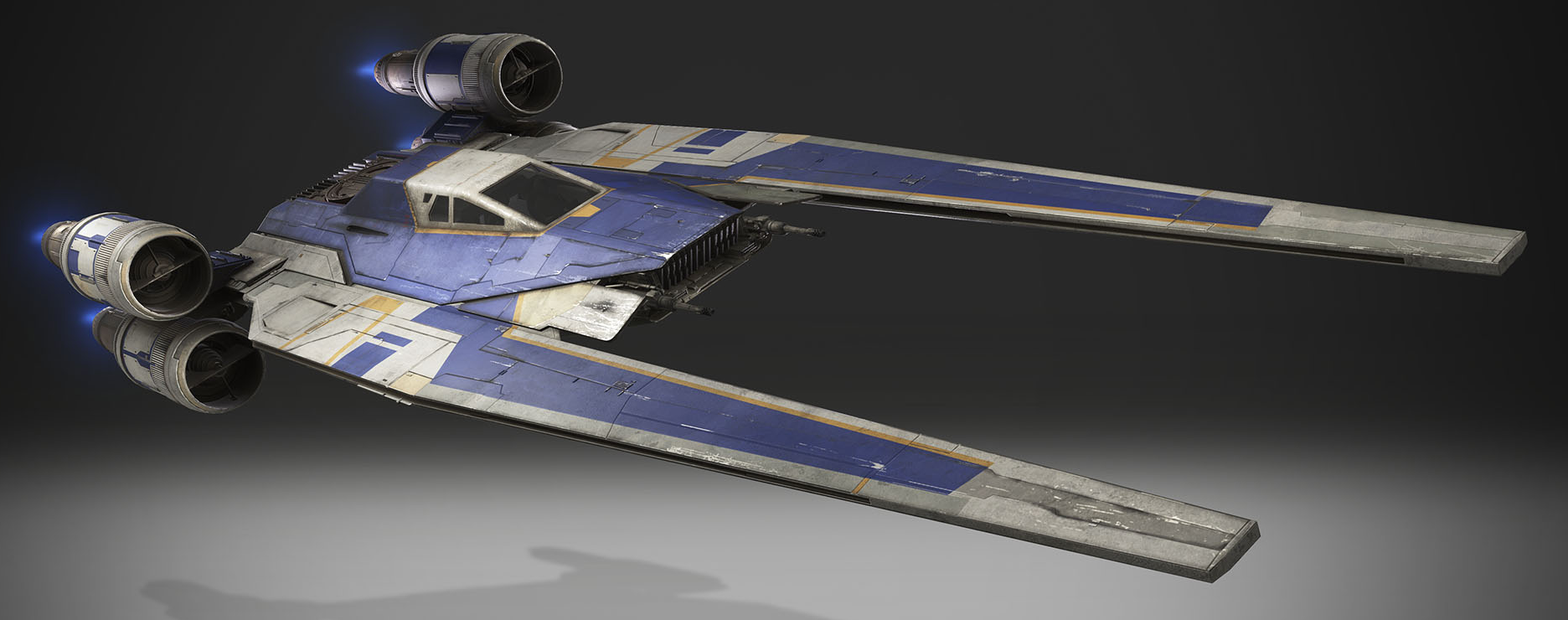
Star Wars example: the Incom UT-60D U-Wing. Designed by Doug Chiang for Rogue One, the design of the U-wing uses some of the same techniques as the fighters from the original trilogy. When they were designing the ships for Star Wars, the team looked to World War 2 dogfights for inspiration. By using the shapes, styles, and design language of these old fighter planes for sci-fi ships they created crafts that the audience just “gets.” When designing the U-Wing, Doug and his team looked to Vietnam-era troop transport helicopters for inspiration. By using familiar things from our world, they’re able to create a fictional world that is easily understandable and tech that you can understand intuitively. With just a glance, you can tell that this is a ship meant to carry soldiers to the front lines, and then get out again.
3. Personality: Does the design have personality such as benign, powerful, or weak?
As designers, we’re in the business of communication. Your designs need to tell the story you want to tell or convey the information you need the user to know. This is about more than just the words, icons, or illustrations you use. It’s about creating a cohesive “vibe” between every element in your design. For instance, if you have a landing page for your newest PDF whitepaper download, you should make a user feel like they’re being educated. The wording you use, the graphics you create, and the layout of the page should give them a sense of urgency and value. Another example: a funeral home that provides a guest book for people to sign online if they’re unable to get to the actual funeral. You shouldn’t greet people looking to share their condolences with a flashy, fun, lighthearted page. A subdued color palette, kind yet formal copywriting, and serious imagery will set the right tone and mood for that guest book.
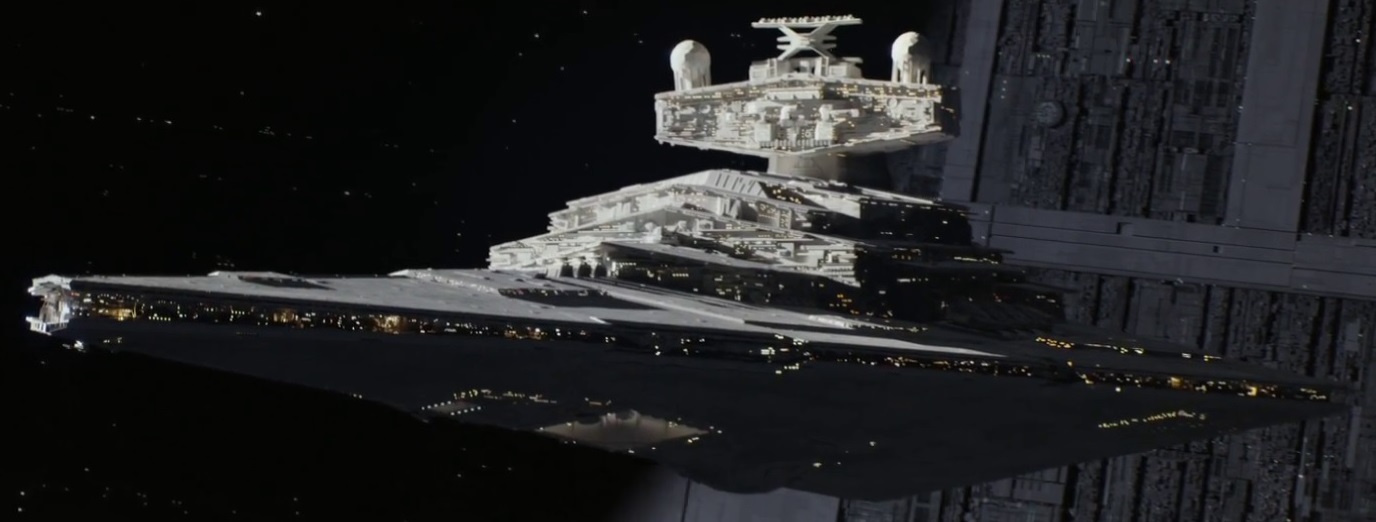
Star Wars example: the Republic, Imperial, and First Order Star Destroyers. When the first Star Wars film came out in 1977, Darth Vader’s flagship, the Imperial I-class Star Destroyer called the Devastator, was the second ship audiences saw in the saga. The instant that ship drifted into the frame you could just tell it was evil. It belonged to the bad guys. With a hulking wedge-shaped hull and stark gray paint job, a Star Destroyer instantly instills a sense of terror, inferiority, and power in anybody who sees it. For The Force Awakens, Doug Chiang took the iconic and recognizable design of the Star Destroyer and updated it for the successors to the Empire, the First Order. With subtle changes, the new model is suited for the modern era while retaining the recognizability and emotions attached to the classic design.
4. Functionality: Can you easily tell how it works and what it’s supposed to do?
In terms of web and graphic design work, this one is closely tied to making complicated dashboards or web app interfaces. If there’s an opportunity to reduce the cognitive load on a user, this is the time to identify those chances and take advantage of them. Let’s say you’re creating an e-commerce site to sell those really cool t-shirts you’ve been designing. Your customer already has a pretty dang good idea of how to shop online, what an online cart looks like, and how the checkout process behaves, so design it to match those expectations!
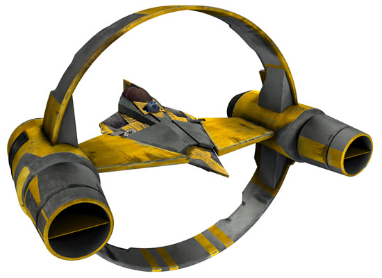
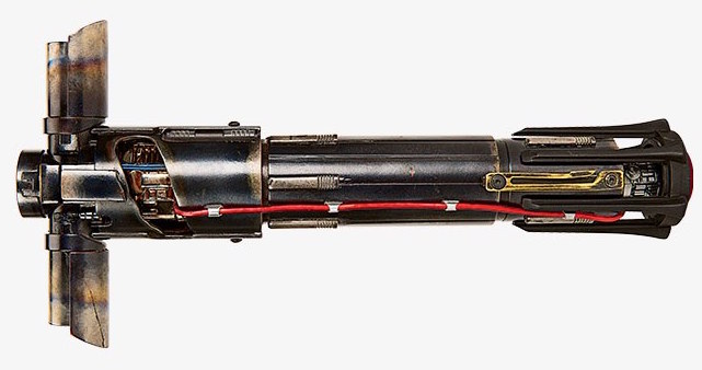
Star Wars example: the Syliure hyperdrive booster ring (alongside the Delta-7 Aethersprite-class light interceptor). The design of this thing is basically a big old ring with two engines on either side of a docking clamp. Just looking at the shape of it you can tell that the Delta-7 slots snugly into the central clamp. With the ring’s engines flanking the ship, along with the ring’s added support, you know at a glance that the hyperdrive ring is meant to make the Delta-7 speedier, or add some sort of extra engine boost.
5. Believability: Is the design mechanically plausible? Does it look as if it can work?
 This one might be a bit of a stretch, but hear me out. When it comes to the web, working within your limitations is crucial. You might have come up with the most refreshing, innovative, groundbreaking, super duper design idea of all time. Then you show it to someone on your dev team and… Well… Your dreams are torn apart. The site doesn’t support a plugin you need, or a CMS doesn’t allow for your pages to be built the way you want them to be. These things suck, but they happen. If your designs aren’t technically plausible, if a dev says that it probably won’t work, you’re gonna have to readdress some things.
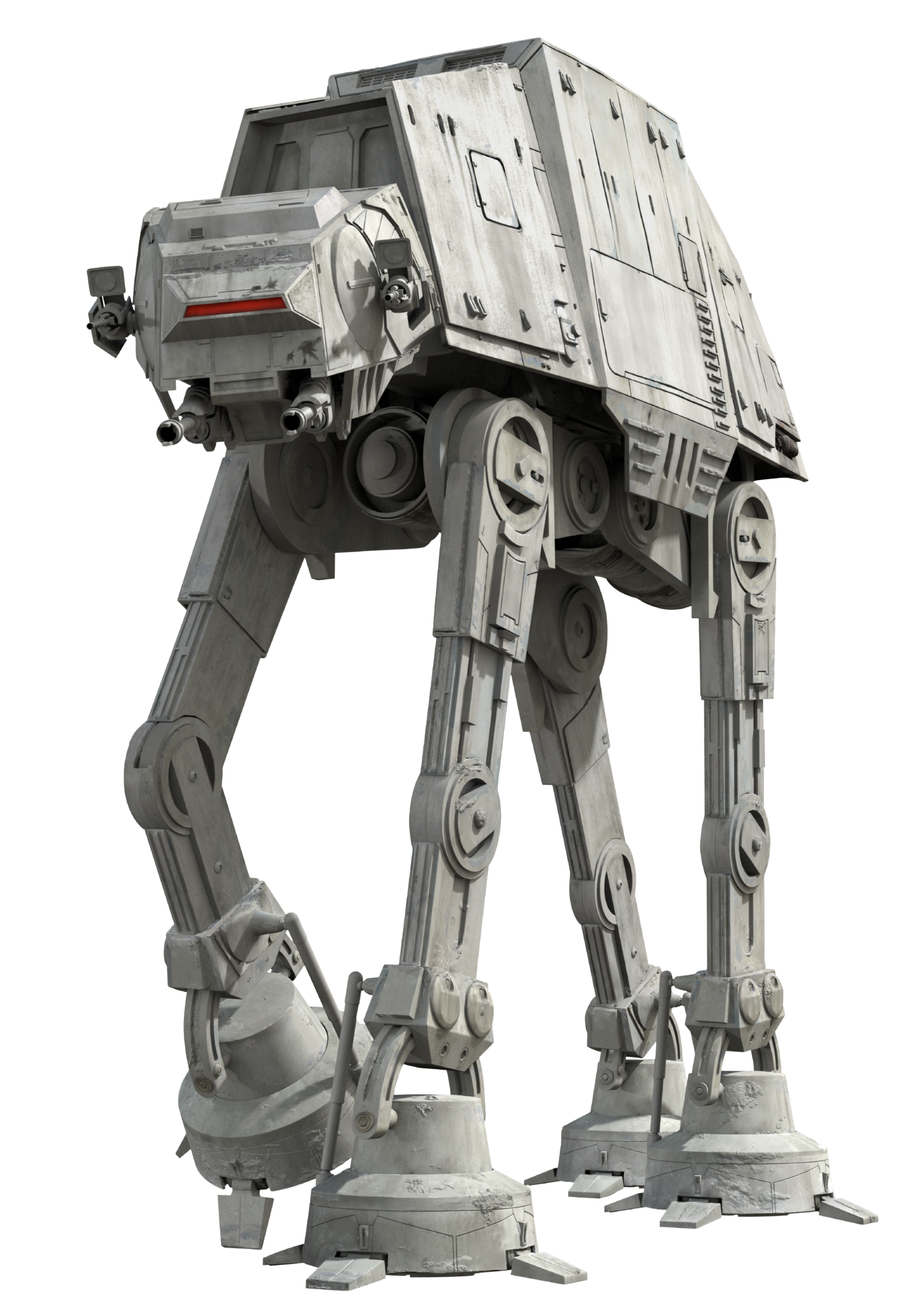
Star Wars example: the All Terrain Armoured Transports, more commonly called AT-ATs. Have you ever really taken some time and thought about these things? Like, take a really close look at them. I’m pretty sure that it’d be physically impossible for them to exist in reality. That’s okay though because at first glance they’re totally believable! When you first see the lumbering gray hulk crest the horizon in Empire Strikes Back, you feel as if the AT-AT is a real, solid object that could physically exist. Despite the ludicrousness of making a bigass tank and then sticking it on super long legs, the design feels right. It feels real. That’s pretty damn cool, in my eyes.
6. Cool Factor: Is the design unique and interesting to look at?
Don’t make boring things! ‘Nuff said! Why waste your audience or users’ time with unengaging content or drab UIs? You should be using all the tools at your disposal to inject at least a little bit of discovery, joy, or just plain coolness into everything you make.
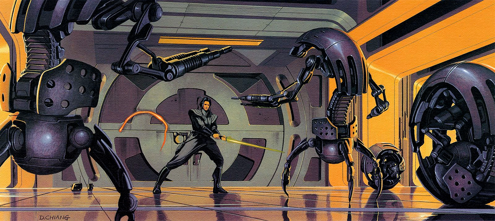
Star Wars example: the Droideka from the Colicoid Creation Nest. Say what you want about the Star Wars prequels, but there’s no way that any sane, rational person can look at a Droideka (also known as a Destroyer Droid) and think it’s lame. Seriously. This thing is so freaking cool. It can roll around, unfurl, it’s got shields, AND IT SHOOTS LASERS OUT OF ITS HANDS. Just, like, whoah. Kinda nerding out here, sorry…
Star Wars has had a massive impact on my design philosophy. Being a boy growing up in the ’90s and 2000s meant I was old enough to have seen the original trilogy and was the perfect age for the release of the prequels. Through those films, I fell in love with Doug Chiang’s work. Later when I knew that design was the field I wanted to be in, his design principles helped guide my creations. No matter what I was working on, I looked for ways to combine my love of Star Wars with graphic design. The design lessons I learned in a galaxy far, far away will always stick with me, even in our crazy jungle full of monkeys.
Your homework:
I encourage you to give the prequels another look. Study the vehicles, ships, creatures, interfaces, and architecture. Analyze them to see if you can figure out the inspirations behind them, or if you can find something to inspire your own work. I think it’s vital for us working on the web to seek out inspiration in every creative field, not just graphic or web design. Film, poetry, stage shows, comedy, skateboarding, water polo, bonsai, vintage car restoration, anything!
Most of all though, may the Force be with you. Always.