The Cheeky Monkey Media Blog
A few words from the apes, monkeys, and various primates that make up the Cheeky Monkey Super Squad.

Don’t Doubt Design
 January 31, 2020 / Treena Bjarnason
I’ve heard quite a few questions in my career as a designer, and a lot of them show just how nebulous and mysterious our job is to most folks. Questions like, “oh, so you make stuff look pretty?” or, “you draw like, logos and stuff?” and even, “can you tell me what the best font is for my website for kids?” It’s Times New Roman, by the way. Just sayin’.
Anywho, I don’t think that the average person really knows how much ground the term design covers, let alone how critical good design is to their business. That’s fair, though! A lot of design work happens behind the scenes. Hell, I’d argue that most of the design process happens behind the scenes. You can kind of think of us sort of like the Great Wizard of Oz. All that the public sees is the cool giant flaming head, but meanwhile, we’re hiding behind the curtain, paying close attention to a myriad of different inputs and outputs. All that work behind the scenes is going towards tailoring an excellent experience for you.
Today, we’re going to talk about some of the reasons design is so important and give you a few examples so you know we’re not just making stuff up as we go. We’ll start with some more basic, surface-level stuff, and then clear up some questions you might have around some of the more nebulous, esoteric, big-picture information afterward. To illustrate our points, we’ve invented a fictional brand called The Pet Project and threw together some fake logos and other brand assets for them.
Here’s some context for our fictional company: The Pet Project is a (fictional) multi-national dog grooming conglomerate. Their dog groomers are located worldwide and bring their innovative new mobile pet trimming system to you so that no matter where in the world you go, you’ll always have a pretty pooch or captivating cat.
Books and Covers and Judges. Oh My!
Everyone always says, “never judge a book by its cover,” but we all do it. Don’t lie. Yeah, Todd. I’m looking at you. I know what you’re doing, Todd. I see you, Todd. I know you do it, but that’s not a bad thing! Their whole purpose is to attract your eye, get you interested, and give you a feeling of what the book is going to be about and how it’ll feel. Besides, if nobody judged books by their covers, that’d lead to a lot of unemployed book designers and boring bookstore shelves.
“But Kodie,” you say, “my company is a multi-national dog grooming conglomerate, not a book!” Hold your horses for a second; I’m getting to it! All I’m saying is that you should try to think about your company like it’s a book. You’ve got tons of great services, products, staff members, and stories in your pages that’ll keep your customers coming back. The problem is attracting those first customers and continuing to attract new ones. Now is the moment where your cover comes in. (See, I told you I was getting to it!) If your book is about the history of tanks in World War 2, don’t put a picture of a seahorse riding a spaceship on the cover. It just doesn’t make sense, and it’s going to confuse your audience.
Try to think of the outward-facing visual aspects of your company as that cover. These are items like your logo, your business cards, your website, your signage, your uniforms, and even your messaging. These are the things that potential customers are going to interact with as their first touchpoint to your company, and we all know how important first impressions are. If you’re wearing a grubby, ripped leather jacket, people might look at you like some sort of apathetic punk. If you were wearing a three-piece suit, people might see you as a competent professional.
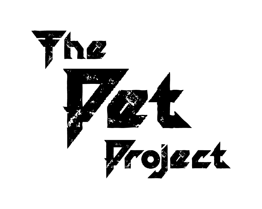
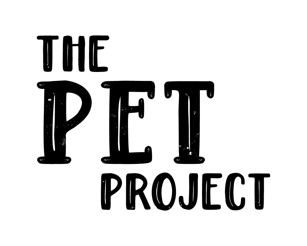
Here are two different logos for The Pet Project. One of them is harsh, with sharp edges and straight lines. The other is softer, with organic strokes, and a friendly hand-written feel.


At a glance, which of these feels more like the world leader in mobile pet pampering? Not the one that looks like AC/DC drew it, right?
This thinking extends to every forward-facing part of your business. The colors you use can invoke different feelings in people and might have different meanings from country to country. Even the way that you answer your phones can make a customer feel appreciated if you do it properly, but they can feel alienated and ignored if you do it wrong.
Ask yourself: do your visuals match the mood you’re trying to create? The imagery you use in your social media posts, annual reports, or website conveys the tone and voice of your company, so make sure it’s your voice, and it’s saying what you want it to say!