Sometimes it can be a bit difficult talking to a designer. Vectors? Wordmarks? Kerning? Huh? To help you navigate those confusing conversations we’ve put together a guide detailing the various types and subtypes of logos that you can find out in the wild.
What is a logo?
A logo isn’t just a picture you put on the front of your business card, it’s often the first touchpoint customers and clients have with your brand. Sometimes your brand might even have more than one logo! A great logo should act as a visual shorthand representing your company’s values, products, mission, and services. That being said, there’s a lot of industry lingo thrown about that can make talking about logos a bit confusing sometimes. Let’s take a look at the three main different categories of logos and how to identify them.
Text-Based
Exactly what they sound like, text-based logos consist of, well, text! More than just typing out your name or abbreviation in a standard font, text-based logos are typically made of custom-modified fonts, custom digital lettering, or even written/drawn by hand. A well-designed text logo can be reproduced at any size with minimal loss of clarity. Text-based logos can be separated into two major categories: lettermarks and wordmarks.
Lettermarks
When your company has a long multi-word name a lettermark can be your best friend. By abbreviating your long company name into a shorter lettermark, customers and clients will have an easier time remembering who you are and what you do. Some examples of these would be IBM (International Business Machines), the Vancouver Opera, or the New York Yankees.
Wordmarks
When you have a unique business name, take pride in it and display it prominently with a beautiful wordmark! Wordmarks can be best used when you want strong name recognition or if you are a new company just starting out. Think of Google, Coca-Cola, or Jeep for some strong examples.
Graphic Based
When you think of the word “logo” these are usually the kind that pops into your mind. By using graphic elements you can visually convey an idea or emotion to your customer or client. Another benefit of graphic-based logos is rapid visual recognition. Graphic-based logos can be sorted into several categories: symbol marks, abstract marks, or mascots.
Symbol Marks
Symbol mark logos, also known as pictorial marks, are standalone images, usually representing a real physical object, person, or place. While they can be the most memorable of all logos, it can be difficult to exclusively use a symbol mark as a new business. Finding the right image for your symbol mark is the most crucial point, and should represent what your business is all about. Twitter, Target, and the World Wildlife Federation (WWF) all have phenomenal symbol marks.
Abstract Marks
Rather than picking a specific “thing” to be the graphic element of your logo, abstract marks use shape, line, and color to convey your company’s message. By creating a completely custom image for your logo, you have total freedom to visually represent your company and its values. For example, a bold boxy shape could convey stability or weight, and a thin curving line could represent elegance, grace, and movement. Pepsi, the Olympic rings, and Chase Bank are some well-known examples of abstract logos.
Mascots
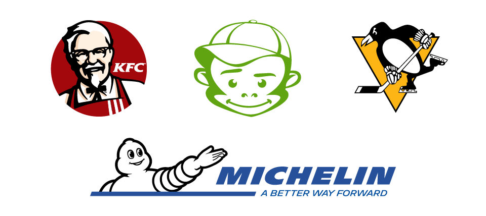
Although they’re less common than symbols or abstract marks, mascots can be a great way for customers to identify with your business. Sports teams frequently use mascots in their logos and extended branding. By using a human character, animal, or any other sort of mascot you can help to encourage your customers to perceive your brand as a personality, rather than a company. Furthermore, you open up the opportunity to use your mascot as a brand ambassador in your marketing. Heck, even us Monkeys have a mascot! A few other fantastic examples are KFC’s Colonel, the Michelin Man, or Penguin Pete from the Pittsburgh Penguins. As a matter of fact, the Michelin logo is a combination mark with both a mascot and a wordmark side by side! Now that I mention it, that leads us to our next type of logo…
Combination Marks
Lastly, we have the combination mark! This type of logo consists of both graphical and text elements that can be used together or separately. Emblems, corporate logos, and even coats of arms fit into this category.
Combination Marks
A combination mark is well, just that! It’s a combination of pictorial and text elements to create a full logo. Often times these two combined elements can be used separately from one another too, making them extremely versatile. A few examples of companies using combination marks are Microsoft, Adobe, and Louis Vuitton.
Emblems
Typically the most visually complex, emblem logos can convey a sense of authority, history, or strength. Emblems are employed by large companies and organizations such as NASA, Harley Davidson Motorcycles, and Lions International.
In Conclusion
Because your brand is important on so many levels, you should never be satisfied with compromise when it comes to any of its components. Your logo design is a handsome and well-groomed ambassador for your company.
Have questions about building a stronger brand for your organization? Ask us how we can help you with your brand!


