The Cheeky Monkey Media Blog
A few words from the apes, monkeys, and various primates that make up the Cheeky Monkey Super Squad.

Who did the designs and branding for DrupalCon 2016 – New Orleans
 April 28, 2016 / Treena Bjarnason
Last year, Cheeky Monkey Media went to the 2015 North American DrupalCon in Los Angeles and didn’t tell anyone that we did the branding and design for the event. Doh!
We didn’t want to make the same mistake this year – it just doesn’t fit with our cheeky and sometimes cocky personalities – so we’ve been blowing up social media letting everyone know that we’re the ones lucky enough to be working with the Drupal Association (DA) on 2016 North American DrupalCon in New Orleans.
In the past, we’ve done quite a bit of work with the DA, everything from DA Job Boards to interface design to branding and design work for the DrupalCons. As Chris Arlidge, the creative mind behind the designs, explained when he sat down for a quick chat with Spela Grasic, the marketing gorilla,
Working with the DA is really good. The team that we work with is very efficient. Everything is sort of all lined up, and we knock everything down one thing at a time. We have weekly or bi-weekly meetings to make sure we are on track with everything and deliverables. We’re in it for the long haul.
Q. So, what exactly did Cheeky Monkey Media do for the 2016 North American DrupalCon in New Orleans?
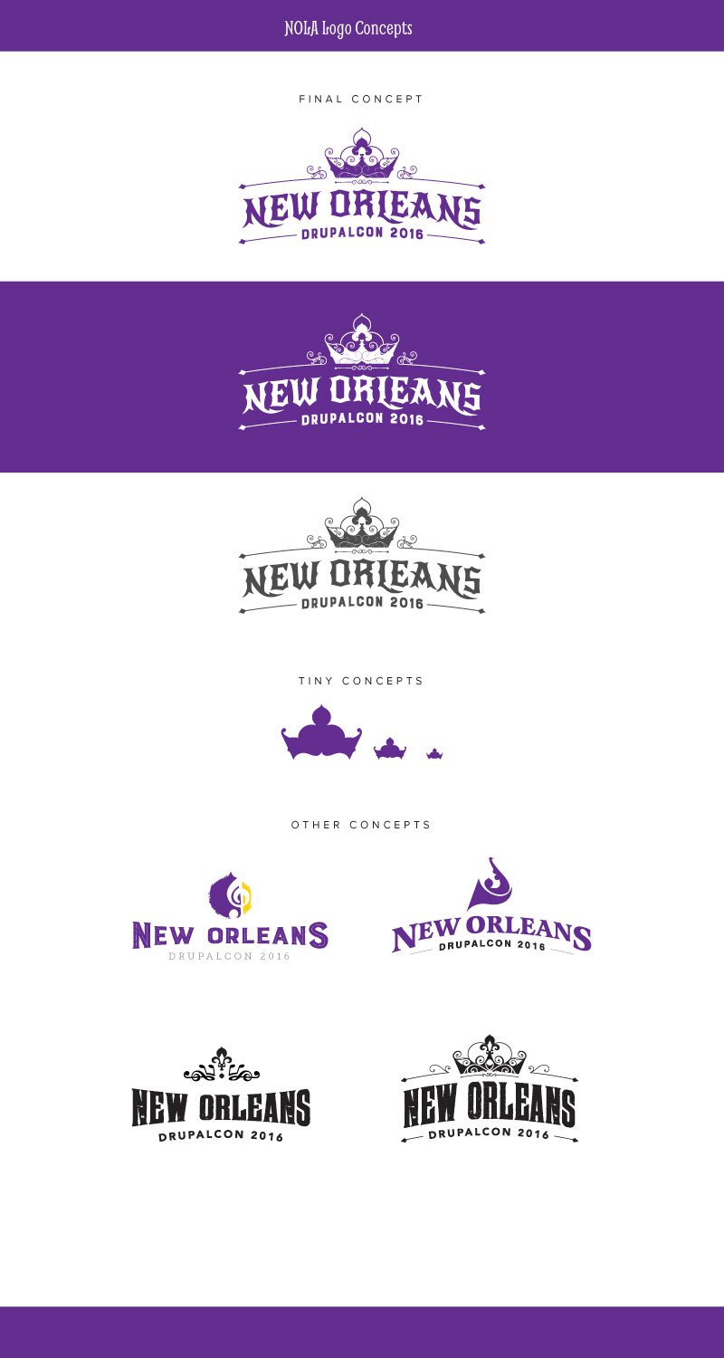
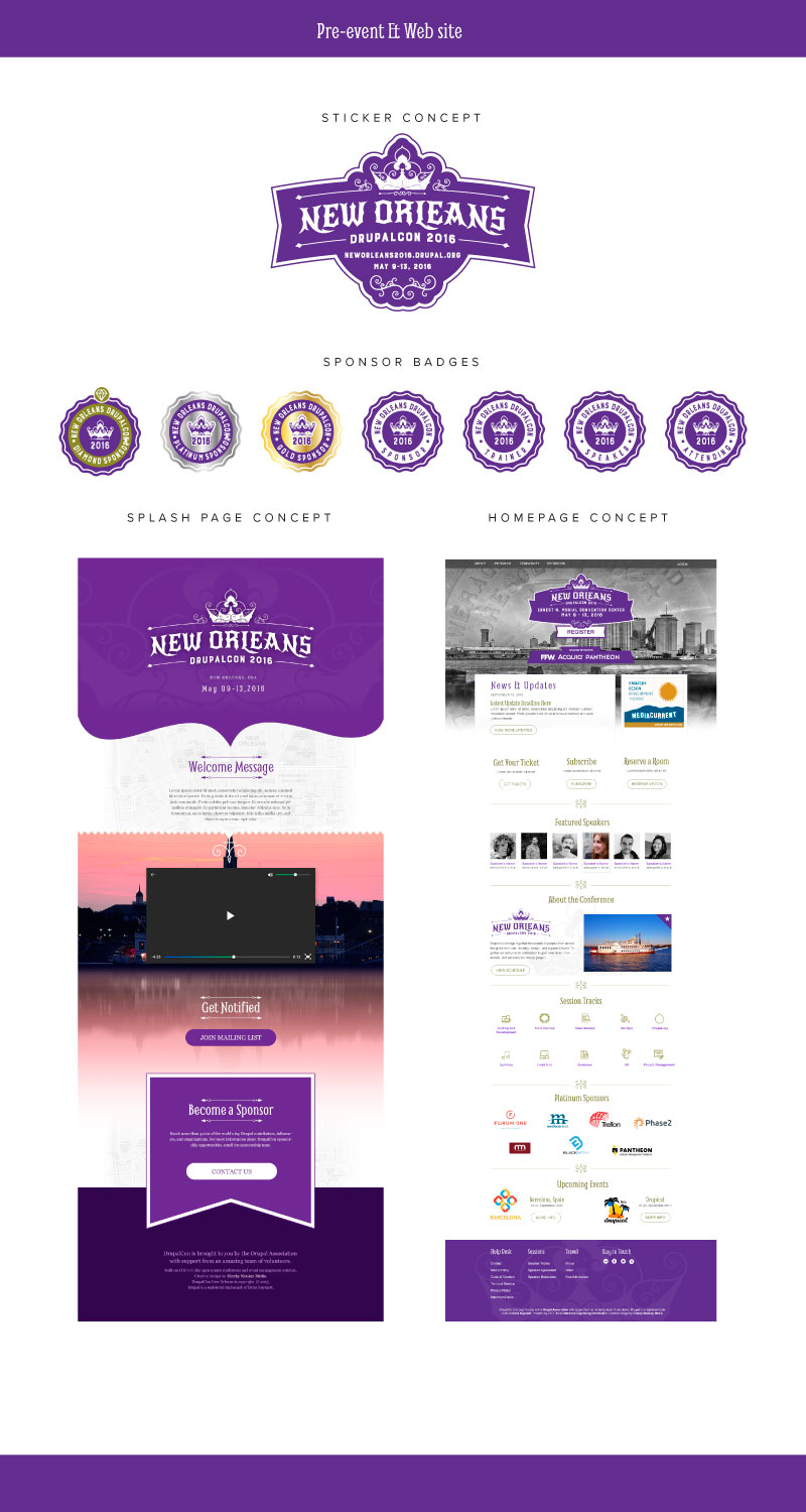
We did the same work for New Orleans as we did for Los Angeles. We start by doing a logo design and brand identity for the Con itself. Cons are usually selected for a city, so we try to capture that city’s energy. Then there are a lot of different deliverables: we do the user interface design, or rather the graphic design for the website; then we do signage, so wayfinding and signage; T-shirts; program guides; presentation slides; and lanyards. I would say that 90% of the DA’s visual presence at the conference is stuff we do or we prepare so the DA can do it on site.
Q. That sounds like a lot of design prowess, a lot of work, and a lot of moving parts. How do you make it happen?
In point form:
1. The DA along with the chosen city’s community team, provides Chris with a Community Feedback document. The Community Feedback document is a high-level overview of the city that highlights the city’s well-known aspects along with what to avoid, or negative aspects. This community feedback is very in-depth and is integral to setting the tone for an upcoming conference.
2. Chris starts researching and drawing ideas.
3. Chris provides the DA and community team with a series of sketches for the logo
4. They agree on a version
5. The rest of the material is designed.
It’s only five steps, but every step takes multiple attempts and iterations.
And in a little bit more detail…
The city’s history and energy play a huge role in branding and designs. To get this energy right, we do a lot of research. We do some of this research on our own, and we work with the DA and members of the local community, who are our eyes and ears on the ground. They give us a flavor of what we should do and what we shouldn’t do for things. From here, the fun part starts: injecting yourself and bringing out your personality and then shaping that identity around that. From there you give the team you are working with a multitude of options, and you hope that they pick it.
Once we get the branding and logo to the point that we and the DA are happy with it (remember, artists never feel fully satisfied), we incorporate this design into the rest of the deliverables: website graphic design, presentation templates, signage, lanyards, etc.
Throughout the process, the DA and the community group continually give feedback on the designs that we do and send and make sure that things are being built up properly. Ultimately the DA and that particular community group decide the final version.


Q. What works really well about approaching the project way?
Having a team that is inspired by and committed to an identity. Yes, sometimes constructive criticism can be stinging; yes, sometimes it hurts; but, you have to distance yourself from it, because ultimately you need to look at it and go, is this actually bringing the goals of the project forward?
As a graphic designer, you have to embrace critique. It’s what enables project goals to come to fruition.
To find out more email us at [email protected].