About City of Armstrong
Just 73 kilometers from Kelowna, located in the beautiful Spalumcheen Valley, the City of Armstrong is an agricultural hub found between the Okanagan and Shuswap regions of British Columbia. Whether you are in Armstrong to live, work or play, their community is a memorable, quaint, and welcoming environment for everyone.
The Situation
The City of Armstrong was in need of an updated website that had a fresh new look, while staying true to their country roots. Their old site was packed with information which was organized in a way that made it hard for users to find what they were looking for quickly and efficiently. In addition, updating the site was time consuming for the staff.
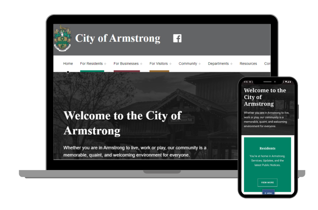
The City’s old website did not reflect the experience of what today’s web user is expecting. The website was not mobile friendly and for those unfamiliar with the site, finding information was hard. The City of Armstrong needed a newly designed website that meets today’s design standards, is attractive, and is mobile friendly. The design of the new site must communicate the city’s unique value as a community for businesses, residents, and visitors while effectively communicating all the information and services the City of Armstrong typically provides during business hours at its municipal offices.
A Unique Approach to the Challenge
Migration and Redesign from Drupal 7 to WordPress
The biggest unique challenge for the City of Armstrong website was that it was a Drupal to WordPress “migration.” While there are tools and ways of migration from Drupal to WordPress, it can become costly in terms of WordPress plugins, as well as keeping our options slim in terms of content plugin stacks. Furthermore, Armstrong’s previous developers were unable to give us complete access to the database and code for the old website, which made a migration impossible, so a complete rebuild was decided upon.
Lessons Learned
When using a page builder or WordPress editor to create pages, it is likely best that we design a small number of standardized content pages prior to entering content, particularly when there are many content pages like with the Armstrong site. This will allow us to ensure the designs will work from a development standpoint, but also ensures that we have sign off on content layouts before we have to make a 5 minute change to 40+ pages.
Site Organization
One of the main issues that the City of Armstrong staff brought up was that while most of what the residents and businesses needed was on their website, they were still getting a lot of calls and emails enquiring about the information. With the City of Armstrong site being a government website, most of that information had to stay. Finding a navigation structure that worked on the new site, without burying that information, was our next challenge.
Updated Navigation and Accessible Design
On the new website we worked with the City of Armstrong team to create a navigation bar that had two tiers of navigation to it. We created top level items called “For Residents”, “For Business”, and “For Visitors”. This allowed us to list the pages that those 3 groups would most likely be looking for quickly. This was considered a “Secondary Menu”. The “Primary Menu” in which we listed all the pages on the site, was then created. The pages are organized in terms of whether they are a community item or a department item.
Having the two tiers of navigation allows for ease of use for multiple people to use the site. For those users that know exactly what they’re looking for they may go straight to departments, whereas those that have no idea, may go to one of the targeted groups to find the information they need.
One thing that was really important to the City of Armstrong was that the site be accessible for all. We chose a WordPress theme that not only worked with the structure of the site but that would also be accessible and easy to use for anyone trying to access the website. We loved that colour coding was built into the theme. This helps users to recognize when something is meant for their targeted audience.
Teamwork Makes the Dream Work
In order to get the site built within our tight timeline, our marketing team, along with the City of Armstrong team, worked together to rewrite quite a few of the pages from the old site before they were put into the new site.
Results
The Cheeky Monkey team completed the website build and launch under the estimated hours, which allows for further tweaks and additions of a couple “nice to have” future features.
The new website is much easier for the City’s internal team to add and update information. They are no longer reliant on external resources to make simple and frequent website edits. The site provides a significantly improved user experience, as it’s now easier for visitors to find information and get to know Armstrong better.
The updated design now meets today’s design standards, including improved WCAG Accessibility features. It finally represents the city’s unique value as a community for businesses, residents and visitors, while effectively communicating all the information and services the City of Armstrong provides.
Another awesome part of this project was that Cheeky Monkey’s Adopt-a-Primate Initiative benefited from the site launch. On behalf of the City of Armstrong, Cheeky Monkey Media donated to Primate Rescue Center and became co-guardians of a sweet orphaned capuchin monkey named Louie.
The Cheeky Monkey team had a fantastic experience working with the City of Armstrong on their new site. We’re excited to continue on with our maintenance support, and making improvements for them in the future.
If your current website sounds like it’s in a similar state, let’s talk and see how our Cheeky Monkey team can evolve your online presence.


