Environmental Law Institute

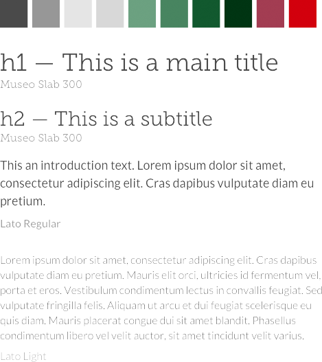
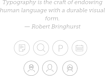
Typography & Palette Examples

The Situation
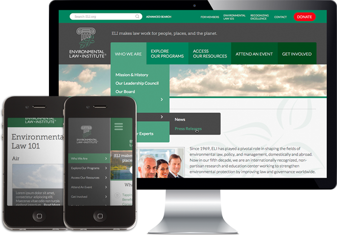
When they first contacted Cheeky Monkey Media, the Environmental Law Institute was in need of a significant design update. Not only had the aesthetics of the web site begun to age, but the navigation of the site had become troublesome. Originally, the Drupal 6 site they were using was adequate to their needs. However, as time went on, and more information was published to the site, the general flow and usability suffered. Articles, information, and publications were difficult to search and find, and this left ELI users with a poor browsing experience. With so much of the organizations work involving events, publications, and learning materials, it was exceptionally important for the group to get a handle on the site design and information architecture.
The Solution
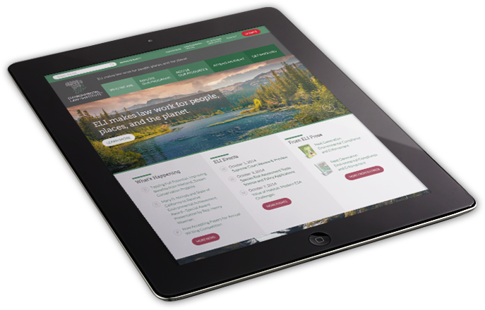
Though the look and feel of the site was ELI’s primary motivation when engaging in their RFP process, it became clear in the early stages of the project that significant work needed to be initiated to organize not just the navigation, but the overall organization of topics, article types, and information. Cheeky Monkey Media set to work on a full scale card sort procedure that allowed ELI to clarify topic “buckets” that could then be used in the development of an intuitive and efficient Information Architecture. From a well-organized IA, to the completion of wireframed layouts, the strategy and user flow through the site was planned for optimal user experience. With design concepts based on solid strategy, the creative team was able to put together an engaging, professional and sleek look for the Environmental Law Institute that will encourage visitors to browse and review the site, but also locate specific information easily.

