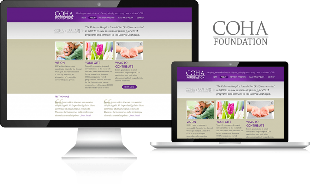
The Situation
The Central Okanagan Hospice Association (COHA) came to Cheeky Monkey with issues common to many website administrators – the site just wasn’t easy enough to navigate, and it wasn’t engaging visitors. It was easy to get frustrated navigating through the site, and information wasn’t organized in an intuitive manner.
These issues led to poor site metrics where user engagement was concerned, and for an organization that relied on the goodwill and donations of site visitors, navigation frustration was a situation they could not afford.
The Solution
First priority – organizing the wealth of information available. The Monkeys put themselves to work developing a sound Information Architecture (that is what it sounds like – a “site plan” for the development). Using wireframe tools, online visualizations, and user experience testing, Cheeky Monkey designed, re-designed and refined how information was served up to site visitors, as well as making the path to donation relatively simple.
The new site was given a sharp new design that engaged user attention and created a welcoming atmosphere. With enhanced visuals, the site made key elements and navigation paths easier to identify and follow. A responsive mobile design was integrated, ensuring that visitors on all browsers and on all manner of hardware could use the site, and the site was given additional engagement tools like user forums and blogs that would attract and retain visitors.


