The Client
The Professional Golf Association of British Columbia (PGA of BC) “is an association of highly skilled and dedicated golf professionals who promote, play, develop and advance the game and business of golf for the benefit of its members and the people of British Columbia.”
When they came to Cheeky Monkey Media, the PGA of BC felt that their website just wasn’t doing their organization justice:
- The website design was dated.
- The website was built on Drupal 6, which made life very difficult for website administrators.
- The website was not mobile-friendly and responsive, which was a problem since many users were accessing the site on mobile.
- The website was difficult to use.
Since the PGA of BC’s vision is to promote the game of golf and benefit its members, they were committed to resolving the status quo. They needed a website upgrade and redesign.
The Organization’s Objectives and Goals
The PGA of BC’s objectives and goals for the website upgrade and redesign was simple:
- To modernize the design and improve user experience on the website, particularly on mobile devices.
- To upgrade Drupal core and make CMS easier on the Admin Side
- Improve the experience for PGA’s users who are accessing the website via mobile.
To achieve these objectives, we agreed on the following deliverables:
- Upgrade the Drupal core from D6 to D7
- Redesign the website so that the visual look and feel of the website matches the PGA of BC
- Make the website more intuitive by creating partner content types and preferred partners pages
- Restructure the content and create an informed information architecture and site map to make the website easier and more intuitive to navigate.
Process
How we Delivered on the Client’s Objectives
We started this project at the beginning of July when we met with the client to go over their goals and objectives. We then spent the next week and a half going through a discovery phase.
The Discovery
During the discovery phase, we dug into the project’s nuances. The project manager and main developer looked into the existing site content and structure and sketch out how we are going to tackle the site rebuild. The discovery team also come up with a list of potential improvements that could be added to the project as extra scope. These findings are then reviewed with the client. The client then determines what additional improvements they would like to add and which ones they wouldn’t.
Wireframes and Design
Following the discovery phase, we start with the wireframes and design stage, which also lasted about a week and a half. For the wireframes, we took into account both a technical viewpoint and a business viewpoint, we created a new structure that would help us accomplish the PGA’s goals as well as address technical issues that arose from the original site. We then based the design on the new structure from the wireframe, we took advantage of the amazing inventory of images the client had and created a new look that delivered on the PGA’s requests to modernize and brighten the site as well as provide ample opportunity to showcase the industry.
Architecture and Project Planning
Once we had our wireframes and design sketched out, we moved onto the architecture and project planning stage, which took approximately two weeks. During this phase, we used the new layouts established in the wireframes and the revised scope we agreed upon after the discovery to break down the site into the various elements that needed to be built, placed, and themed. Then we went through and established estimates for how long each task would take and the dependencies for each task (which task relied on other tasks before it could be completed).
The Build and Redesign
Once we had the outline established, we could begin the dev work. We upgraded the website from Drupal 6 to Drupal 7, completed the rebuild and redesign, implemented new features, and data migration. This phase of the project lasted a month and a half.
Code and Content Freeze and User Acceptance Testing (UAT)
Once we had the site built and designed as the client wanted, we did a content freeze on the current site so that we could do a content migration and a code freeze so that we could complete User Acceptance Testing (UAT) and ensure everything was working exactly as we wanted. This process takes anywhere from two to four weeks depending on the client’s availability.
Website Launch
We launched the website successfully at the beginning of January, six months after the start date.
The Results
The main objective for the PGA of BC website redesign was to improve user experience and to make the website friendlier to mobile users.
By updating the Drupal core from D6 to D7, incorporating a mobile responsive design, and working on the website’s information architecture, we successfully helped our client achieve:*
- A 690% increase in PDF downloads from mobile and tablet traffic.
- A 121.76% increase in revenue from mobile and tablet traffic.
- A 76% increase in unique purchases from mobile and tablet traffic.
*These metrics and all following metrics compare the 3 months after the launch of the redesigned website to the same 3 month period the previous year.
We were able to help our clients achieve these impressive results by improving the website’s overall user experience and by making it easier for administrators to add PDFs and E-commerce offerings to their website. Besides, since the PGA of BC’s main purpose for having a website is to support its members and act as a resource, we were really happy to see an increase in users coming to the website on desktop, mobile, and tablet.
Most notable was the 103% increase in mobile and tablet users and the 40% increase in pageviews from mobile and tablet users.
Similarly, since one of our main goals was to make the website more mobile-friendly and responsive, we were happy to see a general decrease in the average page load time on both desktop and mobile.
- Average Page Load Time decreased by 27%
- Average Page Load Time on Desktop decreased by 37%
- Average Page Load Time on Mobile and Tablet decreased by 4%.
Also, we were thrilled to see an impressive decrease in the average page download time for the website as a whole and Mobile and Tablet traffic when we compared the 3 months post-launch to the same 3 month period in the previous year.
- The average page download time for all users decreased by 11%.
- The average page download time for mobile and tablet traffic decreased by 29%.
- You’ll notice that the average page download time on desktop went up slightly; however, this change is incremental at 0.01 secs.
Our Approach
Why We Chose Drupal Instead Of Other Options. Which Modules, Themes, and Distribution Systems We Used And Why.
We choose Drupal for a couple of reasons. First, the initial website was built on Drupal and the organization was already familiar with its use. Second, given the complexity of feature needs and potential future need for scalability, Drupal just made sense.
In terms of modules, we largely stuck to the ones that were already present and simply updated them. These modules included: Ubercart, views, date, Pathauto, rules, XML sitemap.
We didn’t spend too much time looking for other module options because this client had budget constraints, and we wanted to prioritize design work and making larger changes to the homepage as well as the “Find a Pro” and “Find a Facility” pages. However we did adjust a few modules to be inline with a better experience: media instead of IMCE, Wysiwyg instead of Ckeditor.
For the theme, we used the newest version of our custom CMM theme (Torsion), which uses Zurb Foundation 6, Requirejs, Intentionjs, and underscore js.
What Tools, Programs, And Technologies Did You Use To Do The Design And Development Work?
Drupal, PHP, MySQL, Jquery, Zurb Foundation, Sass, Intention.js, Ubercart, Photoshop, Google Analytics, Twitter API, Slick Carousel, Moneris API
The Challenges
Content Migration
The biggest challenge with this project was probably the content migration. Our original plan for migration was to use the ‘migrate’ module to migrate the D6 content to D7. This plan hit a snag when we started to deal with the Ubercart store content. Ubercart entities don’t currently have a migration path available in the wild when using the ‘migrate’ module.
So, we needed to come up with a solution to migrate these Ubercart entities. This solution would still need to also connect to the other entities in the system that we’re going to be migrated from the ‘migrate’ module.
The solution we came up with was to strip down an instance of the D6 site to the bare modules we needed for the Drupal core and Ubercart, and then we could run through a normal Drupal update process to go from core D6 to core D7 and move Ubercart D6 to Ubercart D7.
At the end of this process, we had a database that had D7 Ubercart tables that we could manually export and import into our other D7 database that we had previously run the ‘migrate’ module migrations to. At that point, we had a fully migrated D7 database with all the correct node and user and file entities plus the Ubercart entities.
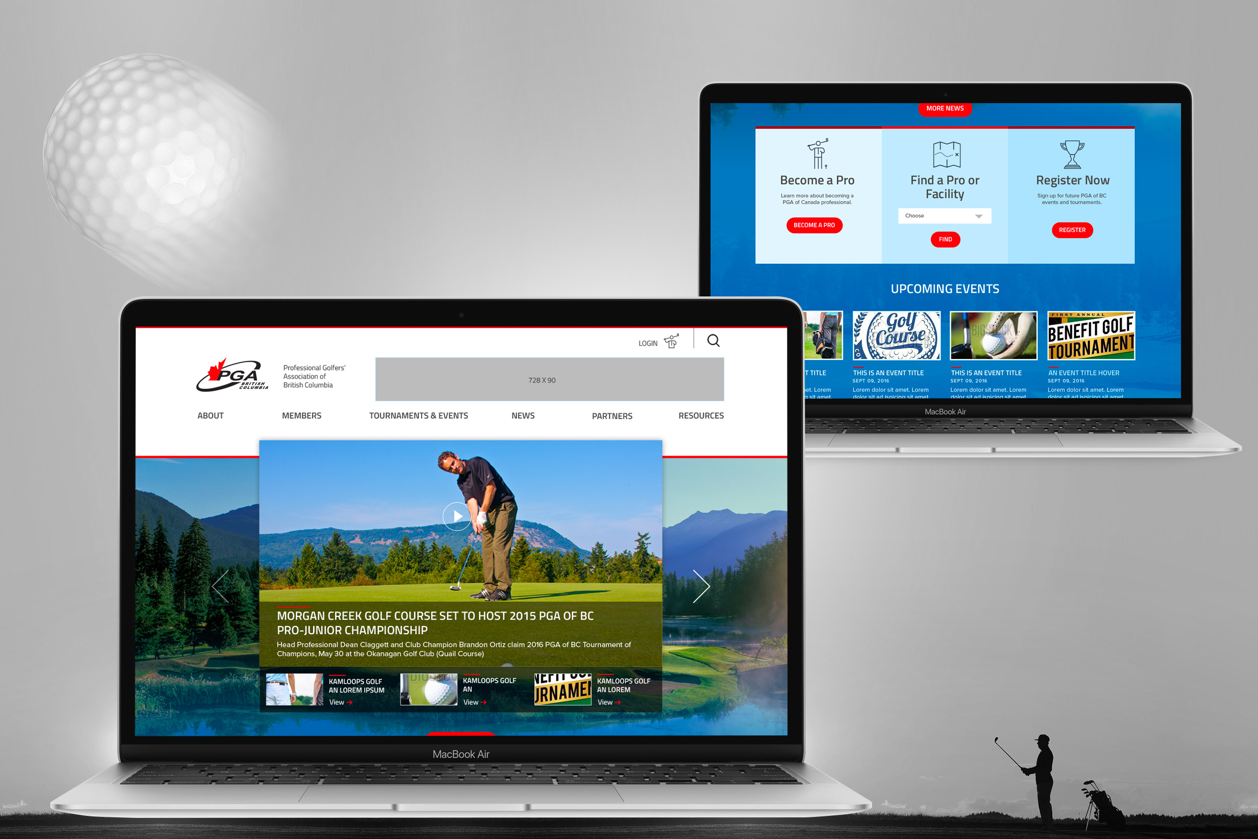
Unique Carousel Slider
Before working on this project, we hadn’t had the opportunity to create a carousel that works the way that this particular carousel works. The way this slider works is that it shows the most recent 4 news items: the big one at the top is the most recent and then the 3 below are the next in line. There are prev and next buttons that move these 4 items around in the same display to make the next one the big highlighted one at the top and moves the others around in a carousel. We initially tried to get the carousel working with Flexslider, but in the end, we found it easier to use another js library called ‘slick’ which ended up giving us the functionality that we discuss above and API that was more useful.
Handling Members-Only Content
While we didn’t exactly struggle with handling members-only content, we did find that it’s better to use a lighter approach to do this rather than a bulky module like ‘content access.’
We ended up using a module called ‘path access’ to just define certain paths in one place that would all be blocked for anonymous users and found that this worked best.


