The Cheeky Monkey Media Blog
A few words from the apes, monkeys, and various primates that make up the Cheeky Monkey Super Squad.

Legibility of Type
 January 29, 2015 / Treena Bjarnason
Arguments and disagreements abound on text legibility. Research in this area is often confusing and contradictory. This is not surprising given the increasing number of ways in which type is published. We have print, kiosks, desktop monitors, signs, and many mobile devices from phones to tablets. In this article, I would like to address some basic guidelines about the issue of text legibility.
What Typeface should you use?
Believe it or not, there is no difference in readability between serif and sans serif typefaces. So the typeface you choose should be based on your aesthetic preference. Or, it could be dictated by branding guidelines.
![]()
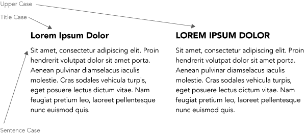
What case should I use and when?
For large blocks of text, sentence case (the first word of the sentence is capitalized) should be used, while uppercase or title case can be effective for headings, or large types. It may surprise you that research has shown that uppercase text does not impede readability in the way we have been led to believe. We do read it slower, but that is only because it’s not as common (we usually read things in mixed cases). There is an exhaustive but enlightening article by Kevin Larson that talks about this and how we recognize letters and read.
We have been conditioned to see uppercase as ‘shouting’. Uppercase letters also take up more space than mixed cases. These are two good reasons not to use them for large blocks of text.

Does Size Matter?
Well yes, it does! A general rule of thumb for printed work is using 9-12 pt text for body copy. Using smaller text sizes is okay but should be used for captions or notes. You may have to use larger text sizes for low-resolution displays, or if your audience is advanced in age. A popular responsive framework, Zurb Foundation, sets its baseline text size at 16 px/pt. For web and user interface design, this is a good place to start given today’s larger monitor sizes and resolutions.
Contrast
Text is most readable when the contrast of the foreground to the background is high. So dark text on a light background or vice versa is optimal. If you are designing applications or interfaces where you need to follow accessibility guidelines such as WCAG (Web Content Accessibility Guidelines) you need to keep this contrast ratio as high as possible. Here is a good tool to make sure your text color and background colors are compliant combinations: http://webaim.org/resources/contrastchecker/

Justification of Blocks of Text
Often it is just an aesthetic choice to use justified or unjustified text. It should be noted that on the web, browsers aren’t as advanced as desktop publishing applications like Adobe Indesign. Programs like Indesign are good at adjusting text/word spacing. Sadly, on the web at least, full justified text can end up with more rivers (jagged lines of spaces between the words) and odd word spacing.
Line Length & Line Spacing
For 9-12pt text (in print) a line length of 3 to 5 inches is preferred. This results in approximately 35 to 55 characters per line when using proportional width typefaces.
Line spacing (or leading) is measured from baseline to baseline. As a general rule – adding 1 to 4 points to the type size is acceptable. Readers find shorter lines of text easier to read, but it can be slower (having to jump down and back to the beginning of the line).
There is a great tool for determining line spacing, characters per line, and font size based on text block width. Calculations are based on the golden section.
In Conclusion
There is a lot of research out there, and a lot of opinions, I would love to hear what you think.