
A few weeks ago, when I first started writing our website maintenance blog series, I asked one of our developers (Calvin Tyndall) to give the first blog a quick review. Calvin had a number of really good suggestions, but one really stood out to me. He suggested that I change one of the paragraphs on mobile to:
Mobile wasn’t an issue a few years ago; now, if your site design isn’t mobile friendly, you’re going to alienate your users and be punished by Google. What’s the next trend going to be? Are you ready for it?
I think this sentence sums up the mobile situation almost perfectly. Why almost?
Well, mobile isn’t exactly a trend. It’s not going anywhere, anytime soon, which means it’s not one of those trends like Pokemon Go.
Don’t get me wrong, the brands that got on the Pokemon Go train and were able to capitalize on it definitely got some sweet ROI. But, and this is a big but, the brands that didn’t get on the Pokeman Go train aren’t suffering long-term consequences.
Do you see what I mean?
If you don’t get on the mobile train, you will suffer long term consequences.
I absolutely cannot stress that enough.
Seriously, tweet it, tell your grandma, teach your dog to run around town delivering the message. Or, write it on the chalkboard like Bart Simpson.

I don’t care how you remember it, just repeat it until you’re convinced.
Why is being on Mobile so Important?
I can go on and on about why you need to be on mobile, and how almost 60% of Google searches now happen on mobile and so on and so on; but, if you’re like me, you probably need some real life examples.
So, I decided to reach out and ask the internet community to share their experiences with both websites that are mobile friendly and websites that aren’t mobile-friendly. I got a ton of responses back, almost as many as when I asked about websites that were not properly maintained.
Below, I’m including a brief discussion of what the respondents shared with me and what you can do to make sure that, a. this doesn’t happen to you, or b. you can salvage the situation if it does happen.
Your Users are on Mobile so Being Mobile Friendly Improves Return on Investment (ROI)
One of the first responses to my inquiry came from Jeff Moriarty, whose family owns www.mothersfamilyrings.com.
Mobile Traffic and ROI Increase
Last fall, Jeff explained, his family’s company updated their website “to be more mobile friendly” because they noticed that more than half their users were visiting their site from a mobile device. After the update, they observed:
- A decreased bounce rate,
- People spending more time on their website,
- An almost 30% increase in purchases from mobile devices,
- A substantial increase in overall sales.
That seems like a win in my books.
Overall Traffic Increase
Similarly, James McCarthy, an Irish-born Web Developer and SEO who works for Placement Labs, shared a story about improving the mobile layout of an MRI directory with over 40,000 locations listed across the US.
The results James shared are incredible.
See for yourselves:
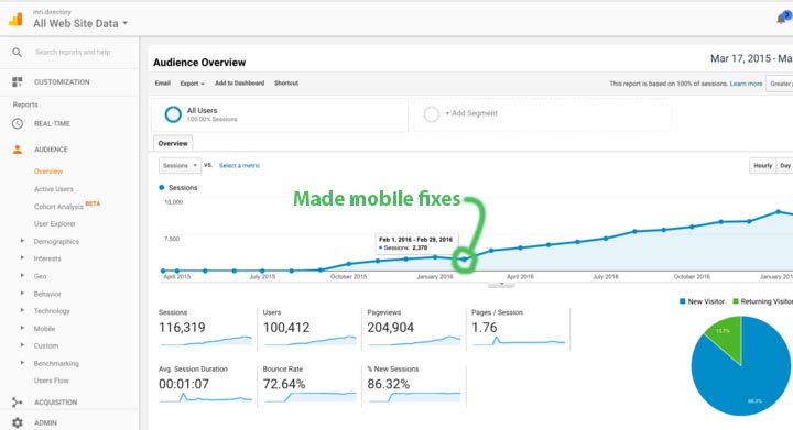
Following improvements to the mobile layout of the site, overall traffic increased by almost 100%.
Wow. I don’t know about you, but I like the idea of achieving an almost 100% increase in traffic to my site.
Mobile is Important for your Search Engine Ranking
Still not convinced? Here’s what Amanda Thomas, Sr. Director of Marketing at Liaison Technologies has to say:
Although we have never received a complaint from from a customer for not having a mobile-friendly site in the past, we noticed our traffic took a 6% dive in April of 2015. Sure enough, this was due to Google actually making ‘mobile-friendly’ a ranking factor. Once we re-optimized our site, traffic increased by 8%.
Depending on how much traffic your website gets, a 6% dive can be painfully noticeable. It’s not a risk you want to take.
Sites that Aren’t Mobile Friendly Turn Users Off
Tyler Riddell, Director of Marketing for eSub Construction Software, shared his own reaction to websites that aren’t mobile-friendly:
When I go to a site that is not mobile-optimized, I immediately get turned off and exit. Sites that are not formatted for mobile devices tend to be thoroughly hard to navigate. If I’m doing a search on my phone, it usually means I simply don’t have the time to pinch and zoom to navigate. Indeed very frustrating.
I have to say I agree with Tyler. If I start doing research on my phone or receive a link that’s not mobile friendly, that organization is discounted immediately.
Hopefully, by now, I’ve convinced you to seriously consider making your website mobile friendly, if not for Google’s sake, for your user’s sake.
Next, I’d like to show you where and how to find out if your target audience is on mobile (so you can decide how much time and budget to spend on mobile), how to make your website mobile friendly, and how to optimize your site for mobile. ← Yes, those last two things “mobile friendly” and “optimized for mobile” don’t mean exactly the same thing. I know, I know. So many terms.
How do I know if my target audience is on mobile?
Before you assume that your users aren’t on mobile, check. It’s easy and it’s free.
1. Make sure you have Google Analytics on your site. Don’t worry, it’s free. You just have to add it.
2. Sign into Google Analytics and select your website.
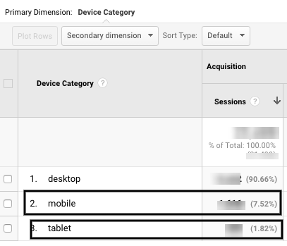
3. Look under Audience -> Mobile -> Overview
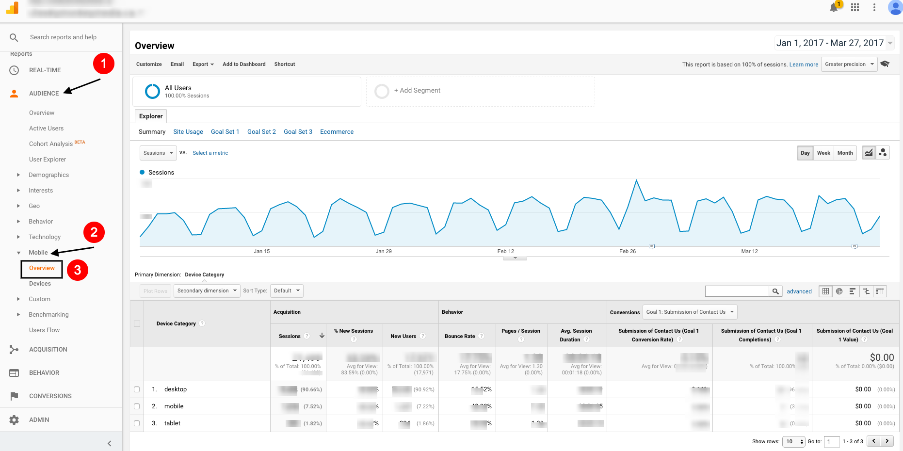
4. Once there, you can see what percentage of the people coming to your website are accessing your site from a mobile or tablet device.
5. If it’s a high percentage (ie. more than 10%), and your website isn’t on mobile or optimized for mobile, you are most likely missing out on valuable traffic.
6. The other place you’ll want to look, to see how your website does in terms of mobile traffic is the bounce rate. If your bounce rate is high (over 20%, unless you’re a blog because blogs generally have pretty high bounce rates), you’re either reaching the wrong users or the users are getting frustrated with your website and leaving.
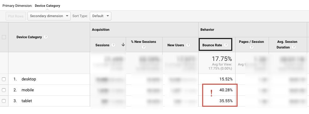
* In the case of our site, I’m not too concerned with higher bounce rate on mobile, because I know that most of our target audience uses a desktop (90.66% in fact). However, if we were a restaurant or eCommerce site, or a straight content distribution site, I would be concerned about these numbers.
Note: Even if you, like us, notice that a very small segment of your target audience is using mobile (less than 10%), and decide not to invest too much time into optimizing your site for mobile, you still want to ensure that your website is mobile friendly.

Why?
Many users are like me and Tyler. If we see that a site isn’t mobile-friendly, or mobile responsive, we will discount that organization immediately.

Moreover, your search rankings will be worse if your website is not mobile friendly, which means that even if a user is searching on a desktop, they will be less likely to come across your site.
How do I Make My Website Mobile Friendly
First, you need to understand what mobile friendly means.
My favorite way of thinking about mobile friendly web design comes from a small blog post by Suzanne Trevellyan:
When we ask, “Is a site mobile-friendly?” we don’t mean, “Is the site visible on mobile phones?” What we want to know is, “Does the site offer a good user experience on a small screen?”
I love this way of thinking about websites and mobile friendly design. If your website gives the user a good experience on mobile, it’s mobile friendly. If your website is a pain to use on mobile (i.e. you have to scroll in and out and move the page around to find what you’re looking for) your website is not mobile-friendly.
I’m not sure if my website is mobile friendly or not?
Have no fear website administrator, Google has a solution for that! It’s called the Mobile-Friendly Test. You throw in your URL and it gives you a score.
Here’s what comes up if I throw in Cheeky Monkey Media’s URL – https://www.cheekymonkeymedia.ca.
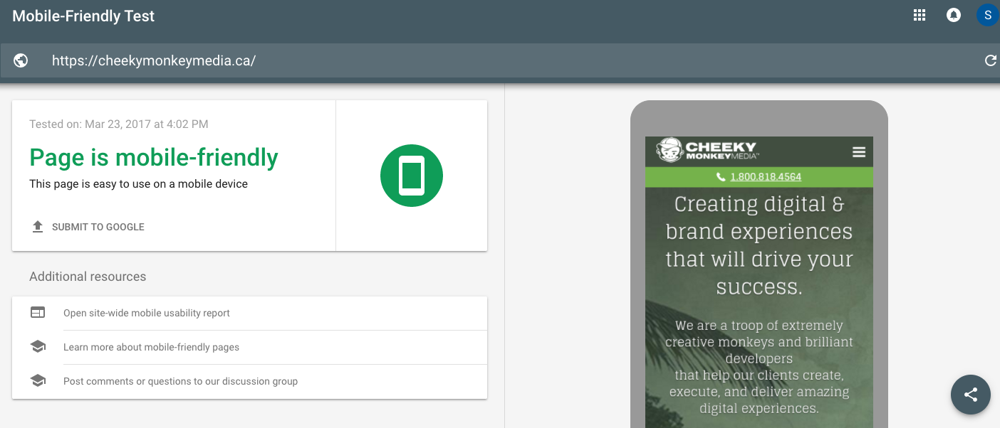
We’re mobile friendly. Yay! Users are not pulling their hair out or flinging their phones in frustration when they try to view our website on a mobile device.
Uh oh, my site isn’t mobile friendly …?
If you, on the other hand, find that your website isn’t mobile-friendly, you’ll want to go to your web development and design team and request a responsive web design:
Responsive Web design is the approach that suggests that design and development should respond to the user’s behavior and environment based on screen size, platform and orientation. The practice consists of a mix of flexible grids and layouts, images and an intelligent use of CSS media queries. As the user switches from their laptop to iPad, the website should automatically switch to accommodate for resolution, image size and scripting abilities. In other words, the website should have the technology to automatically respond to the user’s preferences. This would eliminate the need for a different design and development phase for each new gadget on the market. Smashing Magazine.
A lot of content management systems, for example, Drupal or WordPress, are responsive out of the box. However, for best results, you’ll want to get a web developer to take a look.
How Can I Optimize My Website for Mobile?
I’m so glad you asked. There are so many things you can do to optimize your website for mobile.
Optimize Call to Actions (CTAs)
I’m going to start with what’s probably the cheapest and easiest: optimizing CTAs. Users interacting with your site on mobile or a tablet are dealing with a smaller screen that has more content stuffed into it.
Consequently, you’ll want to make sure that your CTA buttons are clear and large enough to click on with your thumb. As the Hubspot guide to optimizing your emails for mobile states, make your CTAs touch friendly.
You also want to make sure that you don’t have too many clickable links too close together. Thumbs are pretty big, when you compare them to a phone screen, and you don’t want your user to accidentally click on a button they don’t want to click. Not only is that annoying, it’s frustrating.
Think about Your Navigation
When we talk about optimizing for mobile, we also need to talk about enhancing navigation on mobile websites.
In most cases, users come to a mobile website to get the information they need fast, and they’re usually looking for something specific. For example, one of the biggest frustrations of mobile users that come to a restaurant’s website is if the phone number and open times aren’t right at the top of the screen.
So, as the Kissmetrics blog “8 Mobile Optimization Tips to Improve Your Site’s UX” explains, you want to ensure that you “prioritize the content that users need most” and that you:
Lead your potential customer to the heart of the information, making a clear path to the action you want visitors to complete (buy now, rsvp, download, submit, visit, etc)
In other words, you want to consider the journey your users take on your website and help them complete their journey as efficiently and intuitively as possible.
Optimize Images
As Ilya Grigorik puts it in “Image Optimization” under Google’s Web Fundamentals,
image optimization is both an art and a science.
You want users accessing your site to be able to see images, and you want those images to look good. However, you also don’t want the mobile user’s experience to be slow and frustrating because your image files take forever to download.
Our Senior Interface Developer, Micah Joyner, explains that “you can resolve this issue a couple of different ways depending on your environment and work flow:
At the design application level (ie. if you’re using Photoshop), make sure to save your image for the web and set your optimization settings.
At the CMS level (for example in Drupal) you can set up different image cache styles based on the user’s device.
At the front end compilation level, you can set up a gulp or grunt task that will optimize your graphics. Here are some examples: GULP Imagemin and Gulp SCG Min.”
At Cheeky, we tend to do all three, just to make sure our images are as optimized and our mobile user’s experience is as fantastic as possible.
Make your Site Faster Using PHP 7
If your website uses a lot of PHP coding language, and if you use an open source CMS like Drupal or WordPress, make sure you’ve upgraded to the latest version of php7. Php7 helps your website process content and requests more efficiently, making it faster.
To see the effect this can have read our case study on how upgrading to php7 helped us improve website performance and user experience.
Make your Site Faster by Integrating with AMP
If your website is very content based, for example, if you have a lot of blog content, consider integrating with AMP.
AMP, also known as Accelerated Mobile Pages, basically strips away any extra content and code not necessary for the mobile viewing experience and then pre-renders the useful content so it’s ready as soon as the user asks for it.
For more on this: check out our blog “Does my WordPress Site Need AMP?” and our case study on how we integrated our Drupal site with AMP.
In short, there is a number of things you can do to optimize your website for mobile, but using responsive web development, making your CTAs big enough to click, and thinking about how to make your website run more efficiently (which includes image optimization) are some of the most important.
Using Website Maintenance to Optimize Your Website for Mobile
Some of the tasks listed above are things that you can do yourself. For others, you may need the help of a web development and design team. Other optimization tactics, like writing for mobile, are tactics you might be able to do yourself, but just don’t have time for.
This is where a good website maintenance contract can come in handy. Traditionally, we’ve thought about website maintenance as things a web team does to keep your website secure and ensure that your code is always updated so your modules and plugins work the way they’re supposed to. This still holds true. But, with the world wide web moving so quickly these days, that’s just no longer enough.
Now, maintenance contracts need to consider search engine optimization (SEO), design, marketing, copy-editing, and optimizing websites for mobile. That means, that when you sign a website maintenance contract with a company, you should be able to use some of your budget on things like PHP upgrades, AMP integration, image optimization, mobile copy and so on.
That’s why when you purchase a website maintenance package with us, you can use it for anything: SEO, web design, mobile optimization, code updates, new landing pages, marketing, …. and the list goes on, but we think you get it.
Do you really need a maintenance package?
Unfortunately, we can’t answer that question for you. We would need to talk WITH you to get a better sense of who you are and what you want to achieve as an organization.
When it comes to online properties, it’s our experience that something ALWAYS seems to come up. That something could be an improperly formatted graphic or a landing page that needs to be completely redone to work for mobile. It usually helps to have someone you can call to fix the issue ASAP.
Whether that someone is us, or another company, make sure your website maintenance package includes all the potentials.
Talk to you soon!
Spela and the monkeys.